
According to 2012 Health Canada Canadian Alcohol and Drug Use Monitoring Survey (CADUMS), 78.4 percent of Canadians ages 15 or older reported that they drank alcohol in the past 12 months, 91 percent reported lifetime alcohol use. At least 14 percent of those drinkers drank enough to be at risk for immediate injury and harm with at least 20 percent at risk for chronic health effects, such as liver cirrhosis and various forms of cancer.
Now let’s look at the hard truth.
My first dataset was downloaded from Government Canada website - Volume of sales of alcoholic beverages in litres of absolute alcohol and per capita 15 years and over, from 1989 to 2013.The data seems pretty clean, no missing values.
drink <- read.csv('01830019-eng.csv', stringsAsFactors = F)
drink <- drink[complete.cases(drink[,-1]),]
drink <- drink[drink$SALES == 'Total per capita sales', ]
drink$Value<-as.numeric(drink$Value)
Do we drink more or less compare with several years ago? And what do we drink?
Alcohol consumption is defined as annual sales of pure alcohol in litres per person aged 15 years and older. So I will only use the data per capita.
library(ggplot2)
ggplot(aes(x = Ref_Date, y = Value, group = 1), data = drink[(drink$GEO == 'Canada') & (drink$BEVERAGE == 'Total alcoholic beverages'), ]) +
  geom_line(size = 2.5, alpha = 0.7, color = "mediumseagreen") +
  geom_point(size = 0.5) + xlab("Year") + ylab("Pure Alcohol by Litre per Capita") +
  ggtitle('Alcohol Consumption Per Capita') + theme_solarized()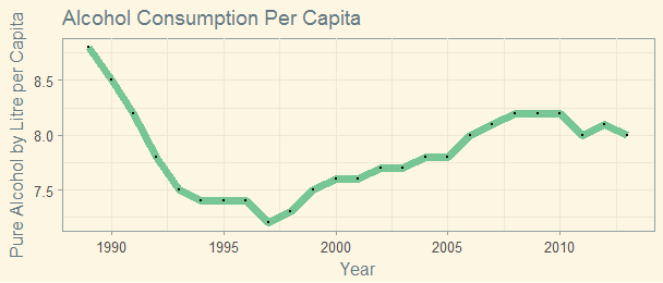
Canadians in about 1989 were bigger drinkers than we are today.
Let’s have a look what we drink.
library(ggthemes)
ggplot(data=drink[(drink$GEO == 'Canada') & (drink$BEVERAGE != 'Total alcoholic beverages'), ], aes(x=Ref_Date, y=Value, group = BEVERAGE, colour = as.factor(BEVERAGE))) + geom_line() + theme_solarized() +
  xlab('Year') + ylab('Pure Alcohol by Litre') + ggtitle('Alcohol Consumption per Capita')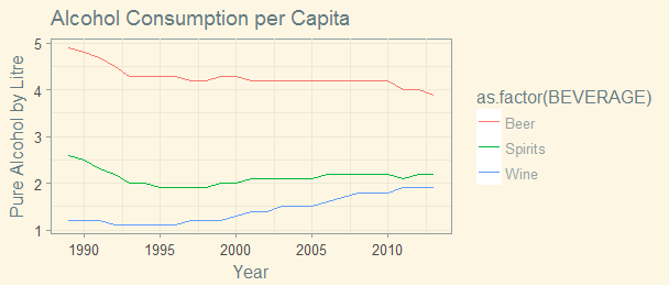
Seems Canadians drink a lot more wine, a little bit more liquor and less beer. Although it’s declining, beer is still the most popular alcoholic drink in Canada.
How about each province?
drink$BEVERAGE <- ordered(drink$BEVERAGE, levels = c('Total alcoholic beverages', 'Beer', 'Spirits', 'Wine'))
ggplot(data=drink[(drink$GEO != 'Canada'), ], aes(x=Ref_Date, y=Value, group = BEVERAGE, colour = as.factor(BEVERAGE))) + geom_line() +
  theme(axis.text.x = element_text(angle = 45, hjust = 1)) +
  xlab('Year') + ylab('Pure Alcohol by Litre') + ggtitle('Alcohol Consumption per Capita') + facet_wrap(~GEO)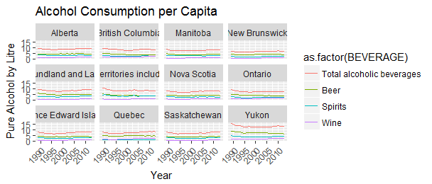
From coast to coast, beer is by far the most favorite drink of Canadians. Not all provinces favor the same drink. Yukon leads nation in total alcohol consumption and beer consumption. Quebec is the biggest per capita consumer of wine,
Explore the data in details for the year 2013.
ggplot(aes(x = reorder(GEO, Value), y = Value, cex.lab =0.01) , data = drink[(drink$Ref_Date== 2013), ] ) +
  geom_bar(stat = 'identity') +
  xlab('') +
  ylab('Pure Alcohol by litre per capita') +
  theme_tufte() +
  theme(plot.title = element_text(size = 16),
        axis.text = element_text(size = 6),
        axis.title = element_text(size = 12)) +
  coord_flip() +
  ggtitle("How Much Canadians Drink in 2013") +
  facet_wrap(~BEVERAGE)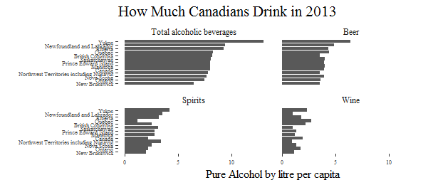
While Yukon leads the nation in total alcohol, beer and spirits consumption, New Brunswick alcohol consumption are the lowest in Canada, and there is no category where New Brunswick consumed more than the national average. And no province drinks more wine than Quebec, but consumption of spirits in Quebec is lower than the other categories and the other provinces.
Canada & Ontario
Because I live in Toronto, it would be interesting to see the evolution of alcohol consumption in Canada and Ontario.
canada <- drink[drink$GEO == 'Canada', ]
ontario <- drink[drink$GEO == 'Ontario', ]
canada_ontario <- rbind(canada, ontario)
ggplot(aes(x = Ref_Date, y = Value, color = GEO), data = canada_ontario) +
  geom_line() + theme_solarized() +
  xlab("Year") + ylab("Pure Alcohol by Litre per Capita") +
  ggtitle('Evolution of Alcohol Consumption in Canada and Ontario') + facet_wrap(~BEVERAGE)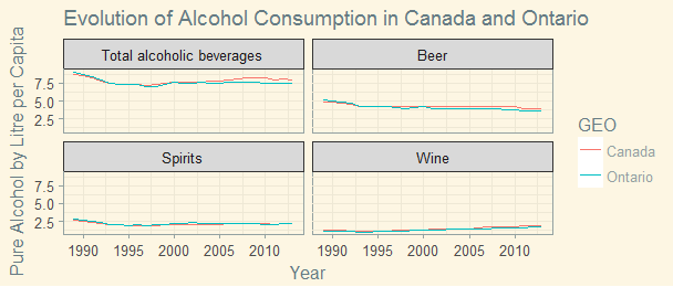
After decreasing until around 1997, alcohol consumption in Ontario began to rise. It has been steady since 2010. Spirits is the only category that Ontario has reached national consumption level.
According to Statistics Canada, Heavy drinking refers to males who reported having 5 or more drinks, or women who reported having 4 or more drinks, on one occasion, at least once a month in the past year.
How heavy do we drink?
My second data source comes from Statistics Canada - Percentage who reported heavy drinking from 2001 to 2014. I will have to scrape the data from Statistics Canada’s web site, clean it up and re-arrange the format.
library(XML)
theurl = "http://www.statcan.gc.ca/pub/82-625-x/2015001/article/14183/c-g/desc/desc01-eng.htm"
theurl.table = readHTMLTable(theurl, header=T, which=1,stringsAsFactors=F)
theurl.table <- setNames(theurl.table, c("Year","Male","Female"))
theurl.table$Year <-as.numeric(theurl.table$Year)
theurl.table$Male <- as.numeric(theurl.table$Male)
theurl.table$Female <- as.numeric(theurl.table$Female)
library(reshape2)
theurl.table1 <- melt(data = theurl.table, id.vars = "Year")
ggplot(data = theurl.table1, aes(x = Year, y = value, colour = variable)) + geom_line() + theme_solarized() + ylab('Percent') +
ggtitle('Percentage who reported heavy drinking by Gender')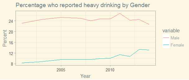
Males are more likely to replot heavy drinking than females. When we see males report less on heavy drinking during the recentl years, females’ report on heavy drinking is on the rise. This is worrisome.
url = "http://www.statcan.gc.ca/pub/82-625-x/2015001/article/14183/c-g/desc/desc02-eng.htm"
url.table = readHTMLTable(url, header=T, which=1,stringsAsFactors=F)
url.table <- setNames(url.table, c("Age","Male","Female"))
url.table$Age <-as.factor(url.table$Age)
url.table$Male <- as.numeric(url.table$Male)
url.table$Female <- as.numeric(url.table$Female)
url.table1 <- melt(data = url.table, id.vars = "Age")
url.table1$Age <- ordered(url.table1$Age, levels=c('Total (12 or older)', '12 to 15', '16 to 17', '18 to 19', '20 to 34', '35 to 44', '45 to 54', '55 to 64', '65 or older'))
ggplot(data = url.table1, aes(x = Age, y = value, fill = variable)) + geom_bar(stat = 'identity', position = position_dodge()) + theme_solarized() + ylab('Percent') +
ggtitle('Percentage who reported heavy drinking by Gender and Age Group') +
  theme(axis.text.x = element_text(angle = 90, hjust = 1, vjust = .4))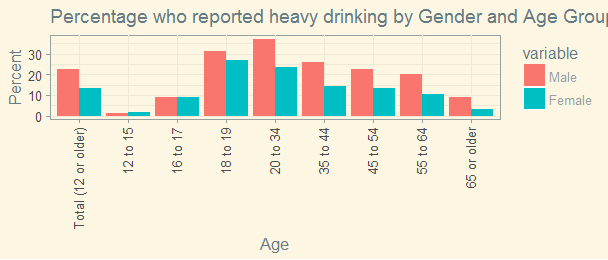
Gender differences in alcohol consumption are found everywhere but closed among 16 to 19 years old. In general, more men binge drink than women, but heavy drinking among young Canadian women should cause alarm.
I would like to drill down into each province, after googling around, I found a small dataset from a Health Canada report - Rates of Heavy Drinking in 2014 by Province and Gender. Because it is in a PDF format, I will have to manully create my own.
library(xlsx)
alcohol <- read.xlsx('alcohol_2014.xlsx', sheetIndex = 1, header = TRUE, stringsAsFactors = F)
alcohol <- melt(data = alcohol, id.vars = "GEO")
ggplot(data = alcohol, aes(x = GEO, y = value, fill = variable)) +
  geom_bar(stat = 'identity', position = position_dodge()) +
  theme(axis.text.x = element_text(angle = 45, hjust = 1)) +
  ylab('Percent') +
  ggtitle('Percentage who reported heavy drinking by Gender and Province in 2014') +
  theme(plot.title = element_text(size = 12))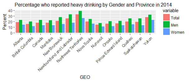
Northwest Territories, Yukon, and Newfoundland & Labrador had the highest heavy drinking rate in 2014, while British Columbia, Nunavut and Ontario reported lower then overall Canadian rate.
A Quick Comparison
It’s time to have a quick comparison with our south neighbour and United Kingdom and Australia, how much alcohol do they drink?
I downloaded a dataset from Word Health Organization(WHO) - Recorded alcohol per capita consumption, from 2000 TO 2014. The dataset need quite some cleaning.
data <- read.csv('data.csv', stringsAsFactors = F)
data$X <- NULL
data$X.1 <- NULL
cols.num <- c("X2010","X2009", "X2008", "X2007", "X2006", "X2005", "X2004", "X2003", "X2002", "X2001", "X2000")
data[cols.num] <- sapply(data[cols.num],as.numeric)
data$X2015 <- NULL
data_can <- data[data$Country == 'Canada', ]
data_usa <- data[data$Country == 'United States of America', ]
data_uk <- data[data$Country == 'United Kingdom of Great Britain and Northern Ireland', ]
data_au <- data[data$Country == 'Australia', ]
data_can_usa_uk_au <- rbind(data_can, data_usa, data_uk, data_au)
data_can_usa_uk_au <- melt(data = data_can_usa_uk_au, id.vars = "Country")
ggplot(data = data_can_usa_uk_au, aes(x = variable, y = value, fill = Country)) +   geom_bar(stat = 'identity', position = position_dodge()) +
  theme(axis.text.x = element_text(angle = 45, hjust = 1)) +
  ylab('Pure Litre per Capita') +
  xlab('Year') +
  ggtitle('Alcohol Consumption from 2000 to 2014')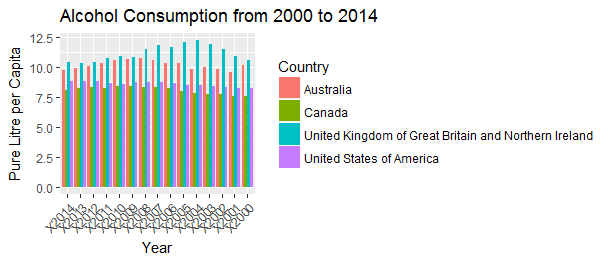
Here it is. Now I believe that The UK has love affair With alcohol.
Where is Canada in the global map?
Again, I am using data from the World Health Organisation, the map below colour-codes countries according to the amount of pure alcohol the average citizen aged 15 or over consumes in a year for 2011.
alcohol_global <- read.csv('alcohol_global.csv', header = T, stringsAsFactors = F)
library(rworldmap)
mapDevice('x11')
al_df <- joinCountryData2Map(alcohol_global, joinCode="NAME", nameJoinColumn="Country")
mapCountryData(al_df, nameColumnToPlot="Pure_Alcohol_by_Litre_per_Capita", catMethod="fixedWidth")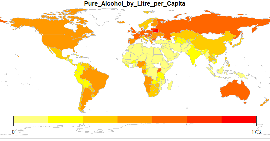
It looks like we drink similar amount of alcohol with the US, Brazil, Argentina, Germany and Poland.
Here is the top 10:
##      Country Pure_Alcohol_by_Litre_per_Capita
##1     Belarus                            17.31
##2   Lithuania                            12.66
##3     Czechia                            12.43
##4     Croatia                            12.19
##5     Austria                            12.04
##6    Portugal                            11.92
##7      France                            11.80
##8     Ireland                            11.72
##9     Hungary                            11.51
##10 Luxembourg                            11.50
Source code that created this post can be found here. I am happy to hear any feedback and questions.
Resources: