
Atlanta Police Department’s online historical crime database has data from 1/1/2009 and is updated weekly. For this analysis I will examine all crime data posted on the Atlanta Police Department Open Data Portal from January 1, 2016 to April 7, 2017.
library(dplyr)
library(data.table)
library(ggplot2)
at <- rbind(COBRA_YTD2017, COBRADATA2016)
str(at)
##Classes ‘tbl_df’, ‘tbl’ and 'data.frame': 35064 obs. of 23 variables:
## $ MI_PRINX : chr "6320920" "6320921" "6320922" "6320923" ...
## $ offense_id : chr "170040711" "170040741" "170040743" "170040794" ...
## $ rpt_date : chr "01/04/2017" "01/04/2017" "01/04/2017" "01/04/2017" ##...
## $ occur_date : chr "01/03/2017" "01/03/2017" "01/03/2017" "01/04/2017" ##...
## $ occur_time : chr "16:00:00" "22:45:00" "20:00:00" "07:50:00" ...
## $ poss_date : chr "01/04/2017" "01/04/2017" "01/04/2017" "01/04/2017" ##...
## $ poss_time : chr "06:00:00" "07:30:00" "00:01:00" "08:00:00" ...
## $ beat : chr "406" "114" "409" "207" ...
## $ apt_office_prefix: chr NA NA NA NA ...
## $ apt_office_num : chr NA NA "I-60" "1049" ...
## $ location : chr "2879 MOCKINGBIRD LN SW" "3466 FAIRLANE DR NW" ##"2929 LANDRUM DR SW" "2025 PEACHTREE RD NE @DARLINGTON APARTMEN" ...
## $ MinOfucr : chr "0720" "0710" "0640" "0440" ...
## $ MinOfibr_code : chr "2424" "2404" "2305" "1399" ...
## $ dispo_code : chr NA NA NA "20" ...
## $ MaxOfnum_victims : chr "1" "1" "2" "1" ...
## $ Shift : chr "Morn" "Morn" "Eve" "Day" ...
## $ Avg Day : chr "Tue" "Wed" "Tue" "Wed" ...
## $ loc_type : chr "20" "20" "26" "26" ...
## $ UC2 Literal : chr "AUTO THEFT" "AUTO THEFT" "LARCENY-FROM VEHICLE" ##"AGG ASSAULT" ...
## $ neighborhood : chr "Audobon Forest West" "Fairburn Heights" ##"Southwest" NA ...
## $ npu : chr "I" "H" "R" "E" ...
## $ x : chr "-84.482590000000002" "-84.500590000000003" ##"-84.483879999999999" "-84.391440000000003" ...
## $ y : chr "33.728960000000001" "33.766730000000003" ##"33.706229999999998" "33.809649999999998" ...The data contains 35064 crimes and 23 variables, and there are some wrangling need to do, such as remove the columns I don’t need, omit ‘NA’s, convert the data to the right types.
at$MI_PRINX <- at$apt_office_prefix <- at$apt_office_num <- at$location <- at$dispo_code <- at$loc_type <- at$npu <- NULL
library(chron)
library(lubridate)
at$lon <- at$x
at$lat <- at$y
at$occur_date <- mdy(at$occur_date)
at$rpt_date <- mdy(at$rpt_date)
at$occur_time <- chron(times=at$occur_time)
at$lon <- as.numeric(at$lon)
at$lat <- as.numeric(at$lat)
at$x <- at$y <- NULL
library(xts)
by_Date <- na.omit(at) %>% group_by(occur_date) %>% summarise(Total = n())
tseries <- xts(by_Date$Total, order.by= by_Date$occur_date)
library(highcharter)
hchart(tseries, name = "Crimes") %>%
  hc_add_theme(hc_theme_darkunica()) %>%
  hc_credits(enabled = TRUE, text = "Sources: Atlanta Police Department", style = list(fontSize = "12px")) %>%
  hc_title(text = "Time Series of Atlanta Crimes") %>%
  hc_legend(enabled = TRUE)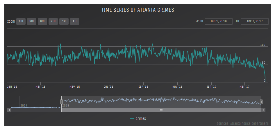
Crimes have decreased in the recentl months.
The number of crimes increased around April, July and September 2016.
at$dayofWeek <- weekdays(as.Date(at$occur_date))
at$hour <- sub(":.*", "", at$occur_time)
at$hour <- as.numeric(at$hour)
ggplot(aes(x = hour), data = at) + geom_histogram(bins = 24, color='white', fill='black') +
  ggtitle('Histogram of Crime Time') + theme_fivethirtyeight()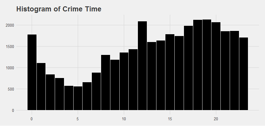
The crime time distribution appears bimodal with peaking around midnight and again at the noon, then again between 6pm and 8pm.
by_neighborhood <- at %>% filter(!is.na(neighborhood)) %>%  group_by(neighborhood) %>% summarise(total=n()) %>% arrange(desc(total))
hchart(by_neighborhood[1:20,], "column", hcaes(x = neighborhood, y = total, color = total)) %>%
  hc_colorAxis(stops = color_stops(n = 10, colors = c("#440154", "#21908C", "#FDE725"))) %>%
  hc_add_theme(hc_theme_darkunica()) %>%
  hc_title(text = "Top 20 Neighborhood with most Crimes") %>%
  hc_credits(enabled = TRUE, text = "Sources: Atlanta Police Department", style = list(fontSize = "12px")) %>%
  hc_legend(enabled = FALSE)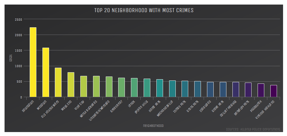
Downtown and midtown are the most common locations where crimes take place, followed by Old Fourth Ward and West End.
by_crimeType <- at %>% group_by(`UC2 Literal`) %>% summarise(total=n()) %>% arrange(desc(total))
hchart(by_crimeType, "column", hcaes(x = `UC2 Literal`, y = total, color = total)) %>%
  hc_colorAxis(stops = color_stops(n = 10, colors = c("#440154", "#21908C", "#FDE725"))) %>%
  hc_add_theme(hc_theme_darkunica()) %>%
  hc_title(text = "Crime Types") %>%
  hc_credits(enabled = TRUE, text = "Sources: Atlanta Police Department", style = list(fontSize = "12px")) %>%
  hc_legend(enabled = FALSE)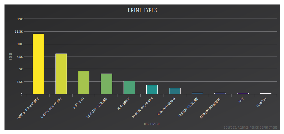
larceny theft are the top crimes in Atlanta followed by aggravated assault
What days and times are especially dangerous?
topCrimes <- subset(at, `UC2 Literal`=='LARCENY-FROM VEHICLE'|`UC2 Literal`=="LARCENY-NON VEHICLE"|`UC2 Literal`=="AUTO THEFT"|`UC2 Literal`=="BURGLARY-RESIDENCE")
topCrimes$dayofWeek <- ordered(topCrimes$dayofWeek,
                                   levels = c('Monday', 'Tuesday', 'Wednesday', 'Thursday', 'Friday', 'Saturday', 'Sunday'))
topCrimes <- within(topCrimes,  `UC2 Literal`<- factor(`UC2 Literal`, levels = names(sort(table(`UC2 Literal`), decreasing = T))))
ggplot(data = topCrimes, aes(x = dayofWeek, fill = `UC2 Literal`)) +
  geom_bar(width = 0.9, position = position_dodge()) + ggtitle("Top Crimes by Day of Week") +
  labs(x = "Day of Week", y = "Number of crimes", fill = guide_legend(title = "Crime category")) + theme(axis.text.x = element_text(angle = 45, hjust = 1))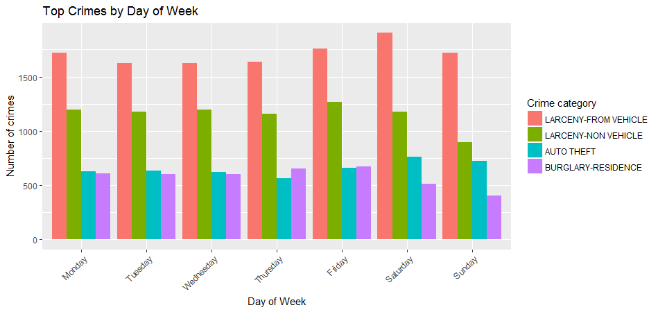
Among the high crime categories, larceny tend to increase on Fridays and Saturdays. while burglary residence generally occurred more often during the weekdays than the weekends. Auto theft were least reported on Thursdays and increase for the weekends.
topLocations <- subset(at, neighborhood =="Downtown"|neighborhood =="Midtown" | neighborhood=="Old Fourth Ward" | neighborhood=="West End" | neighborhood=="Vine City" | neighborhood=="North Buckhead")
topLocations <- within(topLocations,  neighborhood <- factor(neighborhood, levels = names(sort(table(neighborhood), decreasing = T))))
topLocations$dayofWeek <- ordered(topLocations$dayofWeek,
                                   levels = c('Monday', 'Tuesday', 'Wednesday', 'Thursday', 'Friday', 'Saturday', 'Sunday'))
ggplot(data = topLocations, aes(x = dayofWeek, fill = neighborhood)) +
  geom_bar(width = 0.9, position = position_dodge()) + ggtitle(" Top Crime Neighborhood by Day of Week") +
  labs(x = "Day of Week", y = "Number of crimes", fill = guide_legend(title = "Neighborhood")) + theme(axis.text.x = element_text(angle = 45, hjust = 1))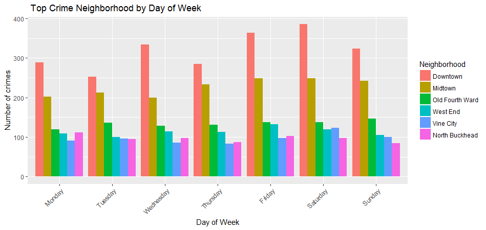
The number of crimes in downtown increased in weekends and decreased on Tuesdays. Crime distribution is fairly even throughout the week for Midtown and Old Fourth Ward. North Buckhead reported least crimes on Sundays.
topCrimes_1 <- topCrimes %>% group_by(`UC2 Literal`, hour) %>%
  summarise(total = n())
ggplot(aes(x = hour, y = total), data = topCrimes_1) +
  geom_point(colour="blue", size=1) +
  geom_smooth(method="loess") +
  xlab('Hour(24 hour clock)') +
  ylab('Number of Crimes') +
  ggtitle('Top Crimes Time of the Day') +
  facet_wrap(~`UC2 Literal`)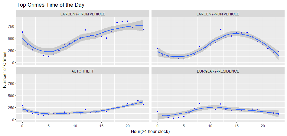
The top crimes exhibit different sinusoid time-interval patterns. Larceny from vehicle declined around 5am and peaked in the evening, Larceny-non vehicle peaked around 3pm, Auto-theft had a steady increase during the day and peaked in the evening, burglary-residence happened more often in the late morning than in the evening.
Plot a location map of Crimes in Atlanta using stats$_$denisty layer.
I want to plot the density of crime on a map of the area around downtown Atlanta. The first step is to get the map data, then create the map use the following:
library(maps)
library(ggmap)
topCrimes$`UC2 Literal` <- factor(topCrimes$`UC2 Literal`, levels = c('LARCENY-FROM VEHICLE', "LARCENY-NON VEHICLE", "AUTO THEFT","BURGLARY-RESIDENCE"))
atlanta <- get_map('atlanta', zoom = 14)
atlantaMap <- ggmap(atlanta, extent = 'device', legend = 'topleft')
atlantaMap + stat_density2d(aes(x = lon, y = lat,
  fill = ..level.. , alpha = ..level..),size = 2, bins = 4,
  data = topCrimes, geom = 'polygon') +
  scale_fill_gradient('Crime\nDensity') +
  scale_alpha(range = c(.4, .75), guide = FALSE) +
  guides(fill = guide_colorbar(barwidth = 1, barheight = 8))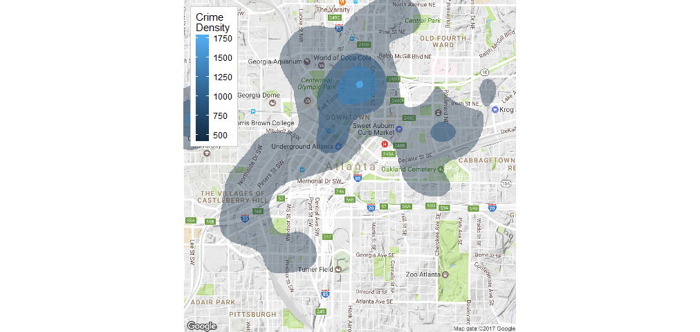
The density areas can be interpreted as follows: All the shaded areas together contain 3/4 of the top crimes in the data. Each shade represents 1/4 of the top crimes in the data. The smaller the area of a particular shade, the higher the crime density.
The End
Remember that we are seeing crime data here, not arrest data, It would be more meaningful if the original dataset contains arrest information. I would be interested to see where the arrests are happening.
Source code that created this post can be found here. I am happy to hear any feedback and questions.