
Want to know how other people die? The Centers of Disease Control and Prevention (CDC) provides estimates for the number of people who die due to each of the causes, from 1999 to 2015. The following are the causes of death at a glance.
url_causes <- "https://ibm.box.com/shared/static/souzhfxe3up2hrh23phciz18pznbtqxp.csv"

df <- read.csv(url_causes)
unique(df$Cause)
sum(df$Deaths)
unique(df$Year)
unique(df$Gender)
unique(df$Age)
df[!complete.cases(df), ]
This mortality data contains 51 causes and 6540835 deaths for the year 2005, 2010 and 2015. The gender are male and female, and the age from 0 to 100. And there is no missing value in the dateset.
So, what are the top causes of death in the United States?
library(ggplot2)
library(ggthemes)
ggplot(aes(x = reorder(Cause,-Deaths), y = Deaths), data = df) +
  geom_bar(stat = 'identity') +
  ylab('Total Deaths') +
  xlab('') +
  ggtitle('Causes of Deaths') +
  theme_tufte() +
  theme(axis.text.x = element_text(angle = 45, hjust = 1))
Heart disease and cancer are far away the most important causes of death in the US. Let?s take these top 10 causes of death and make a new data frame for some plotting, as follows:
library(dplyr)
cause_group <- group_by(df, Cause)
df.death_by_cause <- summarize(cause_group,
                               sum = sum(Deaths))
df.death_by_cause <- arrange(df.death_by_cause, desc(sum))
top_10 <- head(df.death_by_cause, 10)
top_10
ggplot(aes(x = reorder(Cause, sum), y = sum), data = top_10) +
  geom_bar(stat = 'identity') +
  theme_tufte() +
  theme(axis.text = element_text(size = 12, face = 'bold')) +
  coord_flip() +
  xlab('') +
  ylab('Total Deaths') +
  ggtitle("Top 10 Causes of Death")
## A tibble: 10 × 2
## Cause sum
## <fctr> <int>
## 1 Diseases of heart 1883528
## 2 Malignant neoplasms 1729960
## 3 Chronic lower respiratory diseases 424042
## 4 Cerebrovascular diseases 413364
## 5 Accidents (unintentional injuries) 385148
## 6 Alzheimer's disease 265653
## 7 Diabetes mellitus 223721
## 8 Influenza and pneumonia 170153
## 9 Nephritis, nephrotic syndrome and nephrosis 144333
## 10 Intentional self-harm (suicide) 115175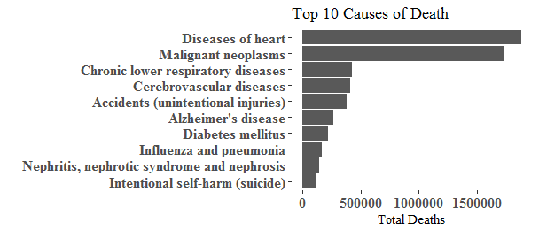
Heart desease remains the leading cause of death in the US, followed by cancer(Malignant neoplasms), Chronic lower respiratory desease takes the third place but by a wide margin.
Are men more likely to die than women? Or vice versa? Does it depend on cause of death or age?
df_top_10 <- df[df$Cause %in% unique(top_10$Cause), ]

ggplot(aes(x = reorder(Cause, Deaths), y = Deaths, fill = Gender), data = df_top_10) +
  geom_bar(stat = 'identity', position = position_dodge()) +
  theme_tufte() +
  coord_flip() +
  ggtitle("Top 10 Causes of Death") +
  facet_wrap(~Year) +
  theme_fivethirtyeight() +
theme(axis.text.x = element_text(angle = 45, hjust = 1)) 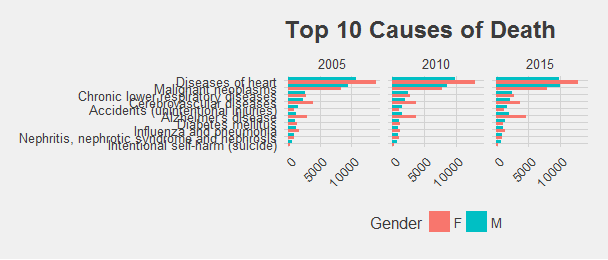
The picture does not change much when we compare 2005, 2010 and 2015. And more Ameican women than men dying for heart disease. Also Stroke(cerebrovascular diseases), Alzheimer’s disease and Influenza and pneumonia seem affect more women than men.
ggplot(aes(x = Age, y = Deaths, color = Cause),
       data = df_top_10[df_top_10$Gender == 'M',]) +
  geom_smooth(method = 'loess') +
  ggtitle('Causes of Death by Age for Male')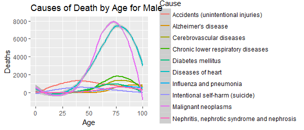
In general, cancer affects male a little bit earlier than heart disease, at peak around 70 years old, heart disease affects more people at older age peak around 75 years old.
Only two diseases affect more yonger people than older people - Accidents and Suicide.
ggplot(aes(x = Age, y = Deaths, color = Cause),
       data = df_top_10[df_top_10$Gender == 'F',]) +
  geom_smooth(method = 'loess') +
  ggtitle('Causes of Death by Age for Female')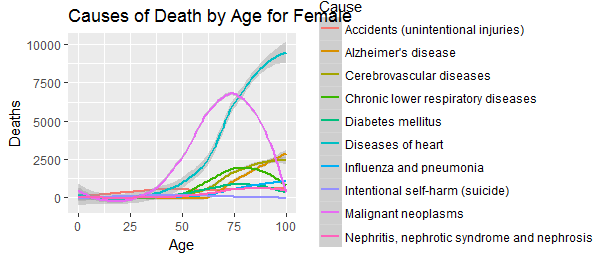
Female developes heart disease more than 10 years later than male, at peak almost at 100 years old. Men appear more vulnerable to heart disease than the inaptly-named ‘weaker sex’. As a result, they succumb earlier.
What the trend look like over time?
A stacked area plot may help to display the trend and development of each cause of deaths over time.
ggplot(aes(x = Age, y = Deaths, color = Cause, fill = Cause),
       data = df_top_10) +
  geom_area() +
  ggtitle('Causes of Death by Age and Gender') +
  facet_wrap(~Gender) +
  theme_solarized()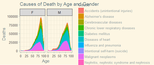
To see the trend over time, I downloaded a new dataset from Centers for Disease Control and Prevention(CDC) and did some cleaning up. This dataset contains deaths, population, crude rate per 100,000 nationwide from 1999 to 2015.
library(xlsx)
mydata <- read.xlsx("mydata.xlsx", 1)
mydata$NA. <- NULL

ggplot(aes(x = Year, y = Deaths), data = mydata) +
        geom_line(size = 2.5, alpha = 0.7, color = "mediumseagreen") +
        geom_point(size = 0.5) + xlab("Year") + ylab("Number of deaths") +
        ggtitle("Deaths in the US")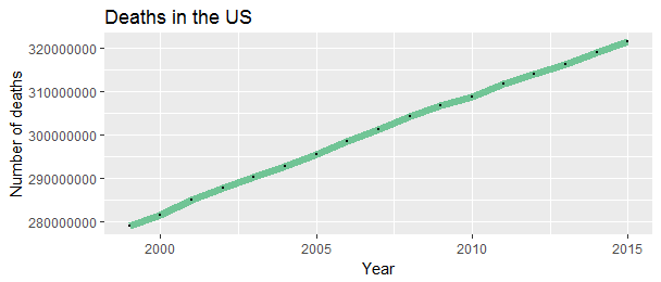
Oh no! This is terrible. The number of death are going up! But the population of US has been growing. We should look at the per capita number of deaths. These things are typically measured per 100,000 population.
ggplot(aes(x = Year, y = Crude_Rate_per_100K), data = mydata) +
        geom_line(size = 2.5, alpha = 0.7, color = "mediumseagreen") +
        geom_point(size = 0.5) + xlab("Year") + ylab("Number of deaths per 100,000 population") +
        ggtitle("Deaths in the US")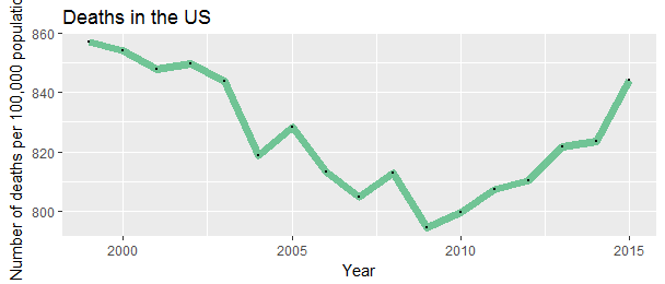
The End
The death rate had been declining for years, an effect of improvement for health and disease control and technology. Until a few years ago, it has been raising in the recent years. If we want more accurate data, we will need the age-adjusted death rate for the total population because the birth rate in the US drops to the lowest point. The population 10 years ago was yonger than the population now.
That’s all for now, next time, probably state by state.
Source code used to make this blog post can be found here.