
I downloaded this wholesale customer dataset from UCI Machine Learning Repository. The data set refers to clients of a wholesale distributor. It includes the annual spending in monetary units on diverse product categories.
My goal today is to use various clustering techniques to segment customers. Clustering is an unsupervised learning algorithm that tries to cluster data based on their similarity. Thus, there is no outcome to be predicted, and the algorithm just tries to find patterns in the data.
This is the head and structure of the original data
customer <- read.csv('Wholesale.csv')
head(customer)
str(customer)
## Channel Region Fresh Milk Grocery Frozen Detergents_Paper Delicassen
##1 2 3 12669 9656 7561 214 2674 1338
##2 2 3 7057 9810 9568 1762 3293 1776
##3 2 3 6353 8808 7684 2405 3516 7844
##4 1 3 13265 1196 4221 6404 507 1788
##5 2 3 22615 5410 7198 3915 1777 5185
##6 2 3 9413 8259 5126 666 1795 1451##'data.frame': 440 obs. of 8 variables:
## $ Channel : int 2 2 2 1 2 2 2 2 1 2 ...
## $ Region : int 3 3 3 3 3 3 3 3 3 3 ...
## $ Fresh : int 12669 7057 6353 13265 22615 9413 12126 7579 5963 ##6006 ...
## $ Milk : int 9656 9810 8808 1196 5410 8259 3199 4956 3648 11093 ##...
## $ Grocery : int 7561 9568 7684 4221 7198 5126 6975 9426 6192 18881 ##...
## $ Frozen : int 214 1762 2405 6404 3915 666 480 1669 425 1159 ...
## $ Detergents_Paper: int 2674 3293 3516 507 1777 1795 3140 3321 1716 7425 ##...
## $ Delicassen : int 1338 1776 7844 1788 5185 1451 545 2566 750 2098 K-Means Clustering
Prepare the data for analysis. Remove the missing value and remove “Channel” and “Region” columns because they are not useful for clustering.
customer1<- customer
customer1<- na.omit(customer1)
customer1$Channel <- NULL
customer1$Region <- NULL
Standardize the variables.
customer1 <- scale(customer1)Determine the number of clusters.
wss <- (nrow(customer1)-1)*sum(apply(customer1,2,var))
for (i in 2:15) wss[i] <- sum(kmeans(customer1,
  	centers=i)$withinss)
plot(1:15, wss, type="b", xlab="Number of Clusters",
  ylab="Within groups sum of squares")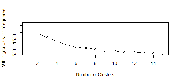
The correct choice of k is often ambiguous, but from the above plot, I am going to try my cluster analysis with 6 clusters .
Fit the model and print out the cluster means.
fit <- kmeans(customer1, 6) # fit the model
aggregate(customer1,by=list(fit$cluster),FUN=mean) # get cluster means
customer1 <- data.frame(customer1, fit$cluster) #append cluster assignment
##Group.1 Fresh Milk Grocery Frozen Detergents_Paper
##1 1 1.9645810 5.1696185 1.2857533 6.892753825 -0.5542311
##2 2 -0.2739609 -0.3783644 -0.4305494 -0.211588391 -0.3831918
##3 3 1.9690056 -0.1118770 -0.1634420 0.135957112 -0.3442663
##4 4 0.5169977 -0.1920274 -0.3383244 2.208659048 -0.4918734
##5 5 -0.5243579 0.7090376 0.9394834 -0.327668397 0.9397185
##6 6 0.3134735 3.9174467 4.2707490 -0.003570131 4.6129149
## Delicassen
##1 16.45971129
##2 -0.19795557
##3 0.35480899
##4 0.09906704
##5 0.09704564
##6 0.50279301Plotting the results.
library(cluster)
clusplot(customer1, fit$cluster, color=TRUE, shade=TRUE, labels=2, lines=0)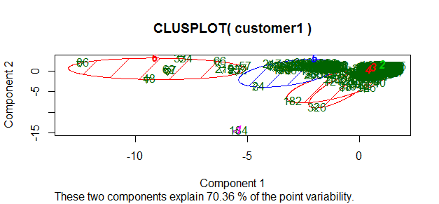
Interpretation of the results: With my analysis, more than 70% of information about the multivariate data is captured by this plot of component 1 and 2.
Outlier detection with K-Means
First, the data are partitioned into k groups by assigning them to the closest cluster centers, as follows:
customer2 <- customer[, 3:8]
kmeans.result <- kmeans(customer2, centers=6)
kmeans.result$centers
## Fresh Milk Grocery Frozen Detergents_Paper Delicassen
##1 50512.095 6987.524 6478.095 10215.381 1030.5238 4904.7619
##2 6683.067 17468.033 26658.933 1986.300 11872.9000 2531.2000
##3 25603.000 43460.600 61472.200 2636.000 29974.2000 2708.8000
##4 22157.050 4045.180 5318.720 3961.420 1148.1700 1726.3700
##5 6664.869 2434.450 3049.880 2824.906 724.4817 886.4503
##6 4324.462 8524.484 12268.753 1383.430 5236.1828 1467.8925Then calculate the distance between each object and its cluster center, then pick those with largest distances as outliers and print out outliers’ IDs.
kmeans.result$cluster # print out cluster IDs
centers <- kmeans.result$centers[kmeans.result$cluster, ]
distances <- sqrt(rowSums((customer2 - centers)^2)) # calculate distances
outliers <- order(distances, decreasing=T)[1:5] # pick up top 5 distances
print(outliers)
##[1] 182 184 326 334 87These are the outliers. Let me make it more meaningful.
print(customer2[outliers,])## Fresh Milk Grocery Frozen Detergents_Paper Delicassen
##182 112151 29627 18148 16745 4948 8550
##184 36847 43950 20170 36534 239 47943
##326 32717 16784 13626 60869 1272 5609
##334 8565 4980 67298 131 38102 1215
##87 22925 73498 32114 987 20070 903Much better!
Hierarchical Clustering
First draw a sample of 40 records from the customer data, so that the clustering plot will not be over crowded. Same as before, variables “Region” and “Channel” are removed from the data. After that, I apply hierarchical clustering to the data.
idx <- sample(1:dim(customer)[1], 40)
customerSample <- customer[idx,]
customerSample$Region <- NULL
customerSample$Channel <- NULL
There are a wide range of hierarchical clustering methods, I heard Ward’s method is a good appraoch, so try it out.
d <- dist(customerSample, method = "euclidean") # distance matrix
fit <- hclust(d, method="ward")
plot(fit) # display dendogram
groups <- cutree(fit, k=6) # cut tree into 6 clusters
rect.hclust(fit, k=6, border="red") # draw dendogram with red borders around the 6 clusters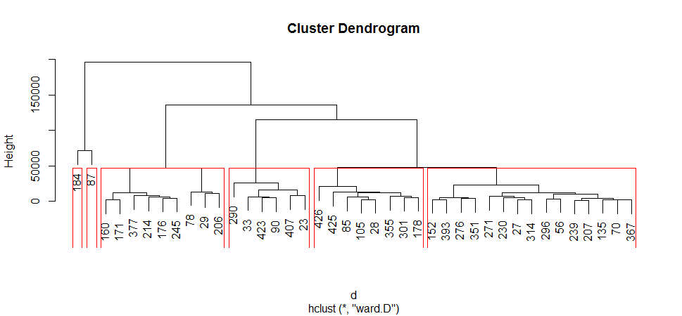
Let me try to interpret: At the bottom, I start with 40 data points, each assigned to separate clusters, two closest clusters are then merged till I have just one cluster at the top. The height in the dendrogram at which two clusters are merged represents the distance between two clusters in the data space. The decision of the number of clusters that can best depict different groups can be chosen by observing the dendrogram.
The End
I reviewed K Means clustering and Hierarchical Clustering. As we have seen, from using clusters we can understand the portfolio in a better way. We can then build targeted strategy using the profiles of each cluster.
The source code can be found here. I am happy to hear any feedback and questions.
Reference: