
Introduction
This is an exploration of 2016 US presidential campaign donations in the state of Massachusetts. For this exploration data analysis, I am researching the 2016 presidential campaign finance data from Federal Election Commission. The dataset contains financial contribution transaction from April 18 2015 to November 24 2016.
Throughout the analysis, I will attempt to answer the following questions:
- Which candidate receive the most money?
- Which candidate have the most supporters?
- Who are those donors? What do they do?
- How do those donors donate? Is there a pattern? If so, what is it?
- Does Hillary Clinton receive more money from women than from men?
- Is that possible to predict a donor’s contributing party giving his (or her) other characteristics?
library(gender)
library(ggplot2)
library(ggmap)
library(gridExtra)
library(dplyr)
library(lubridate)
library(zipcode)
library(aod)
Univariate Analysis Section
ma <- read.csv('ma_contribution.csv', row.names = NULL, stringsAsFactors = F)
str(ma)
##'data.frame': 295667 obs. of 18 variables:
## $ cmte_id : chr "C00577130" "C00577130" "C00577130" "C00577130" ...
## $ cand_id : chr "P60007168" "P60007168" "P60007168" "P60007168" ...
## $ cand_nm : chr "Sanders, Bernard" "Sanders, Bernard" "Sanders, ##Bernard" "Sanders, Bernard" ...
## $ contbr_nm : chr "LEDWELL, BENJAMIN" "LEDWELL, BENJAMIN" "LEDWELL, ##BENJAMIN" "LEDWELL, BENJAMIN" ...
## $ contbr_city : chr "NEWBURYPORT" "NEWBURYPORT" "NEWBURYPORT" ##"NEWBURYPORT" ...
## $ contbr_st : chr "MA" "MA" "MA" "MA" ...
## $ contbr_zip : int 19504700 19504700 19504700 19504700 10269501 2420 ##21392903 24621313 25542718 12016408 ...
## $ contbr_employer : chr "ANDOVER POLICE, MA." "ANDOVER POLICE, MA." ##"ANDOVER POLICE, MA." "ANDOVER POLICE, MA." ...
## $ contbr_occupation: chr "POLICE OFFICER" "POLICE OFFICER" "POLICE OFFICER" ##"POLICE OFFICER" ...
## $ contb_receipt_amt: num 40 35 50 27 100 ...
## $ contb_receipt_dt : chr "04-Mar-16" "04-Mar-16" "06-Mar-16" "06-Mar-16" ...
## $ receipt_desc : chr "" "" "" "" ...
## $ memo_cd : chr "" "" "" "" ...
## $ memo_text : chr "* EARMARKED CONTRIBUTION: SEE BELOW" "* EARMARKED ##CONTRIBUTION: SEE BELOW" "* EARMARKED CONTRIBUTION: SEE BELOW" "* EARMARKED ##CONTRIBUTION: SEE BELOW" ...
## $ form_tp : chr "SA17A" "SA17A" "SA17A" "SA17A" ...
## $ file_num : int 1077404 1077404 1077404 1077404 1077404 1146165 ##1091718 1091718 1091718 1077404 ...
## $ tran_id : chr "VPF7BKWGAE6" "VPF7BKWGCP3" "VPF7BKYF9S6" ##"VPF7BM0K9E6" ...
## $ election_tp : chr "P2016" "P2016" "P2016" "P2016" ...This dataset contains 295667 contributions and 18 variables. To start, I want to have a glance how the contribution distributed.
p1 <- ggplot(aes(x = contb_receipt_amt), data = ma) +
  geom_histogram(bins = 50)
p2 <- ggplot(aes(x = 1, y = contb_receipt_amt), data = ma) +
  geom_boxplot()
grid.arrange(p1, p2, ncol = 2)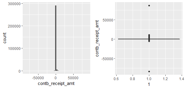
I realized that there were so many outliers(extreme high and extreme low values), it was impossible to see details. And there were negative contributions too.
ggplot(aes(x = contb_receipt_amt), data = ma) +
  geom_histogram(binwidth = 0.05) +
  scale_x_log10() +
  ggtitle('Histogram of the Contribution')
tail(sort(table(ma$contb_receipt_amt)), 5)
summary(ma$contb_receipt_amt)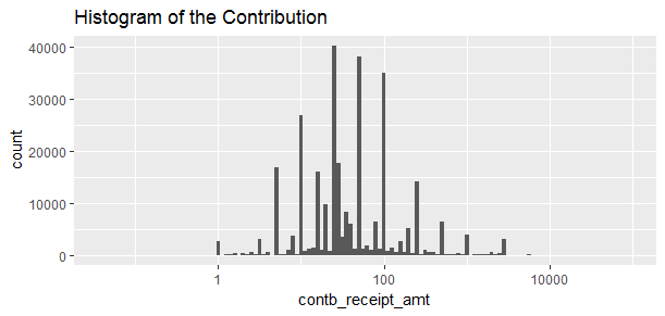
Transforming to log10 to better understand the distribution of the contribution. The distribution looks normal and the data illustrated that most donors made small amount of contributions.
##   5    10   100    50    25
##16780 26856 34241 36978 39546
##> summary(ma$contb_receipt_amt)
##   Min. 1st Qu.  Median    Mean 3rd Qu.    Max.
## -84200      15      28     116     100   86900
Interesting to see how people donate. the most frequent amount is $25, followed by $50, then $100. And the minimum donation was -$84240 and maximum donation was $86940.
To perform in depth analysis, I decided to omit the negative contributions which I believe they were refund and contributions that exceed $2700 limit, because it breaks Federal Election Campaign Act and will be refunded. This means 5897 contributions are omitted.
sum(ma$contb_receipt_amt >= 2700)
sum(ma$contb_receipt_amt < 0)
##[1] 3244
##[1] 2653I will need to add more variables such as candidate party affiliate, donors’ gender and donors’ zipcodes.
democrat <- c("Clinton, Hillary Rodham", "Sanders, Bernard", "O'Malley, Martin Joseph", "Lessig, Lawrence", "Webb, James Henry Jr.")
ma$party <- ifelse(ma$cand_nm %in% democrat, "democrat", "republican")
ma$party[ma$cand_nm %in% c("Johnson, Gary", "McMullin, Evan", "Stein, Jill")] <- 'others'
ma$contbr_first_nm <- sub(" .*", "", sub(".*, ", "", ma$contbr_nm))
ma <- ma[ma$contb_receipt_amt > 0 & ma$contb_receipt_amt <= 2700, ]
ma$contb_receipt_dt <- as.Date(ma$contb_receipt_dt,format = "%d-%b-%y")
gender_df <- gender(ma$contbr_first_nm, method = 'ssa', c(1920, 1997),
                       countries = 'United States')
gender_df <- unique(gender_df)
names(gender_df)[1] <- 'contbr_first_nm'
ma <- inner_join(ma, gender_df, by = 'contbr_first_nm')
drops <- c('proportion_male', 'proportion_female', 'year_min', 'year_max')
ma <- ma[ , !(names(ma) %in% drops)]
ma$zip <- paste0("0", ma$contbr_zip)
ma$zip <- substr(ma$zip, 1, 5)
data(zipcode)
ma <- left_join(ma, zipcode, by = 'zip')
After processing the data, I added 5 additional variables to help with the analysis, and removed 5897 observations because they were either negative amount or amount exceed $2700.
The additional variables are:
- party: candidates party affilliation.
- contbr_first_nm: contributor’s first name will be used to predict gender.
- gender: contributor’s gender.
- Latitude: Donor’s latitude for map creation.
- Longitute: Donor’s longitude for map creation.
After adding the variables, I wonder what the contribution distribution looks like across the parties, candidates, genders and occupations.
party_group <- group_by(ma, party)
ma.contr_by_party <- summarize(party_group,
                               sum_party = sum(contb_receipt_amt),
                               number_of_candidate = length(unique(cand_id)),
                               mean_party = sum_party/number_of_candidate,
                               n = n())
ma.contr_by_party
ma.contr_by_party$party <- ordered(ma.contr_by_party$party,
                                   levels = c('democrat', 'republican', 'others'))
ggplot(aes(x = party, y = n, fill = party), data = ma.contr_by_party) +
  geom_bar(stat = 'identity') +
  geom_text(stat = 'identity', aes(label = n),
            data = ma.contr_by_party, vjust = -0.4) +
  xlab('Party') +
  ylab('Number of Contributions') +
  ggtitle('Total Number of Contributions by Party') +
  scale_fill_manual(values = c('blue', 'red', 'gold'))
sum(ma.contr_by_party$n)
### A tibble: 3 × 5
## party sum_party number_of_candidate mean_party n
## <chr> <dbl> <int> <dbl> <int>
##1 democrat 25832081 5 5166416 243358
##2 others 270771 3 90257 981
##3 republican 4605410 17 270906 24556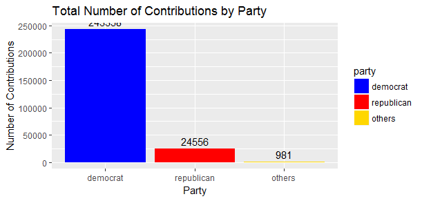
##[1] 268895Until November, 2016, total number of donations made to the presidential election near 269K, and the Democratic party took more than 243K and almost 10 times of the number of donations made to the Republican party.
table(ma$cand_nm)
ggplot(aes(x = cand_nm), data = ma) + geom_bar() +
  theme(axis.text.x = element_text(angle = 45, hjust = 1)) +
  xlab('candidate') +
  ylab('Number of Contributions') +
  ggtitle('Number of Contributions by Candidate')
## Bush, Jeb Carson, Benjamin S. Christie, Christopher J.
## 388 2591 133
## Clinton, Hillary Rodham Cruz, Rafael Edward 'Ted' Fiorina, Carly
## 147534 5624 469
## Gilmore, James S III Graham, Lindsey O. Huckabee, Mike
## 1 110 91
## Jindal, Bobby Johnson, Gary Kasich, John R.
## 1 457 755
## Lessig, Lawrence McMullin, Evan O'Malley, Martin Joseph
## 130 20 269
## Pataki, George E. Paul, Rand Perry, James R. (Rick)
## 3 490 2
## Rubio, Marco Sanders, Bernard Santorum, Richard J.
## 1578 95408 15
## Stein, Jill Trump, Donald J. Walker, Scott
## 504 12256 49
## Webb, James Henry Jr.
## 17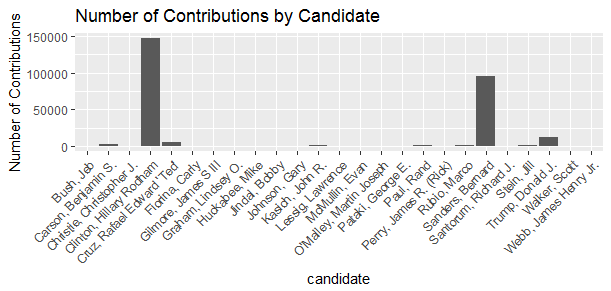
There were total 25 candidates, Hillary Clinton was the leader in the number of contributions, followed by Bernard Sanders, then Donald Trump.
gender_group <- group_by(ma, gender)
ma.contr_by_gen <- summarize(gender_group,
                             sum_gen = sum(contb_receipt_amt),
                             n_gen = n())
ma.contr_by_gen
ggplot(aes(x = gender, y = n_gen, fill = gender),
       data = ma.contr_by_gen, vjust = -0.4) +
  geom_bar(stat = 'identity') +
  geom_text(aes(label = n_gen), stat = 'identity', data = ma.contr_by_gen, vjust = -0.4) +
  xlab('Gender') +
  ylab('Number of Contributions') +
  ggtitle('Number of Contributions by Gender')
### A tibble: 2 × 3
## gender sum_gen n_gen
## <chr> <dbl> <int>
##1 female 15029545 150055
##2 male 15678717 118840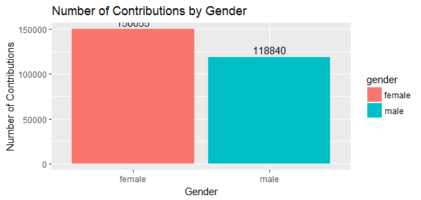
Interesting to know that there were a lot more women than men to made donations, about 26% difference. Was it because of Hillary Clinton? We will find out later.
Who are those donors?
occupation_group <- group_by(ma, contbr_occupation)
ma.contr_by_occu <- summarize(occupation_group,
                              sum_occu = sum(contb_receipt_amt),
                              mean_occu = mean(contb_receipt_amt),
                              n = n())
ma.contr_by_occu <- subset(ma.contr_by_occu, contbr_occupation != "INFORMATION REQUESTED")
ma.contr_by_occu <- head(arrange(ma.contr_by_occu,desc(n)), n = 10)
ma.contr_by_occu$contbr_occupation <- ordered(ma.contr_by_occu$contbr_occupation, levels = c('RETIRED', 'NOT EMPLOYED', 'TEACHER', 'ATTORNEY', 'PROFESSOR', 'PHYSICIAN', 'CONSULTANT', 'SOFTWARE ENGINEER', 'HOMEMAKER', 'ENGINEER'))
ma.contr_by_occu
ggplot(aes(x = contbr_occupation, y = n), data = ma.contr_by_occu) +
  geom_bar(stat = 'identity') +
  xlab('Top 10 Occupations') +
  ylab('Number of Donors') +
  ggtitle('Top 10 Occupations by Number of Donors') +
  theme(axis.text.x = element_text(angle = 45, hjust = 1))
### A tibble: 10 × 4
## contbr_occupation sum_occu mean_occu n
## <ord> <dbl> <dbl> <int>
##1 RETIRED 4480345 108.44 41317
##2 NOT EMPLOYED 1417174 53.55 26464
##3 TEACHER 389587 56.29 6921
##4 ATTORNEY 1313684 212.50 6182
##5 PROFESSOR 876505 142.57 6148
##6 PHYSICIAN 842674 160.11 5263
##7 CONSULTANT 805574 192.12 4193
##8 SOFTWARE ENGINEER 361221 96.48 3744
##9 HOMEMAKER 686431 205.40 3342
##10 ENGINEER 309927 99.69 3109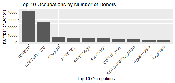
When we count the number of donors, retired people take the first place, followed by not employed people, teacher comes to the third, homemaker and engineer are among the least in terms of number of contributions.
summary(ma$contb_receipt_dt)
ggplot(aes(x = contb_receipt_dt), data = ma) + geom_histogram(binwidth = 30, position = position_dodge()) +
  xlab('Date') +
  ylab('Number of Contributions') +
  ggtitle('Histogram of Contribution Date')
## Min. 1st Qu. Median Mean 3rd Qu. Max.
##"2014-09-25" "2016-03-12" "2016-06-01" "2016-06-01" "2016-09-18" "2016-12-30"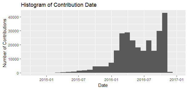
And it is also interesting to see when people made contributions. The date distribution appears bimodal with period peaking around March 2016 or so and again close to the election.
Observations:
- Most people contribute small amount of money.
- The median contribution amount is $28.
- The democratic party receive the most number of donations.
- Hillary Clinton have the most supporters.
- There were 26% more women than men to make contributions.
- Retired people make the most number of contributions.
Bivariate Analysis Section
ma.contr_by_party
ggplot(aes(x = party, y = sum_party/1000, fill = party), data = ma.contr_by_party) +
  geom_bar(stat = 'identity') +
  geom_text(stat = 'identity', aes(label = round(sum_party/1000)),
            data = ma.contr_by_party, vjust = -0.4) +
  xlab('Party') +
  ylab('Contribution Received (Thousands)') +
  ggtitle('Total Contribution Amount by Party') +
  scale_fill_manual(values = c('blue', 'red', 'gold'))
ggplot(aes(x = party, y = mean_party/1000, fill = party), data = ma.contr_by_party) +
  geom_bar(stat = 'identity') +
  geom_text(stat = 'identity', aes(label = round(mean_party/1000)),
            data = ma.contr_by_party, vjust = -0.4) +
  xlab('Party') +
  ylab('Contribution Received (Thousands)') +
  ggtitle('Average Contribution Received by Party') +
  scale_fill_manual(values = c('blue', 'red', 'gold'))
sort(by(ma$contb_receipt_amt, ma$cand_nm, sum))
ggplot(aes(x = cand_nm, y = contb_receipt_amt/1000), data = ma) +
  geom_bar(stat = 'identity') +
  theme(axis.text.x = element_text(angle = 45, hjust = 1)) +
  xlab('candidate') +
  ylab('Contribution Amount (Thousands)') +
  ggtitle('Contribution Amount by Candidate')
sum(ma$contb_receipt_amt)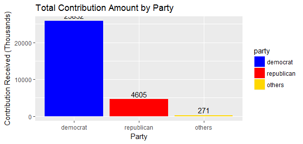
##[1] 30708262The total contribution amount made to the presidential candidates grossed over 30 million US dollars in Massachusetts. We can easily see where the money went.
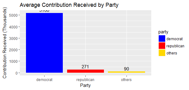
Democratic party takes the majority share of donor contribution. Democratic party got more than 25.8 mollion US dollars in total, which is 5.6 times of what the Republican received. It is getting worse for the Republican when comes to the average amount, as there were 17 Republican candidates and only 5 Democratic candidates.
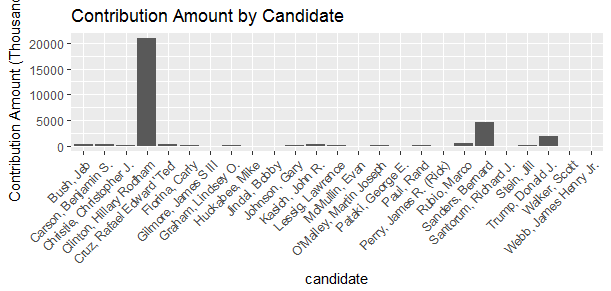
Same with the number of contributions, Hillary Clinton received the most contribution amount followed by Bernard Sanders then Donald Trump.
There is no surprise as Massachusetts is the home of Kennedy family, and routinely voted for the Democratic party in federal elections. And Hillary Clinton has decades-deep roots in Massachusetts politics.
To see contribution patterns between parties and candidates, I start with boxplots.
ggplot(aes(x = party, y = contb_receipt_amt, fill = party), data = ma) +
  geom_boxplot() +
  coord_cartesian(ylim = c(0, 2700)) +
  xlab('party') +
  ylab('Contribution Amount') +
  ggtitle('Boxplot for Contribution Amount by Party') +
  scale_fill_manual(values = c('blue', 'gold', 'red'))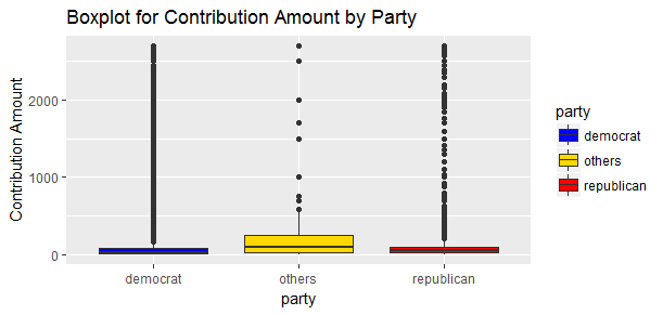
However, it is very hard to compare contributions among all parties at a glance because there are so many outliers. I will apply log scale and remove the ‘others’ party from now on because my analysis is focused on the Democratic party and the Republican party.
ma <- subset(ma, ma$cand_nm != "McMullin, Evan" & ma$cand_nm != "Johnson, Gary" & ma$cand_nm != "Stein, Jill")
by(ma$contb_receipt_amt, ma$party, summary)
ggplot(aes(x = party, y = contb_receipt_amt, fill = party), data = ma) +
  geom_boxplot() +
  scale_y_log10() +
  xlab('party') +
  ylab('Contribution Amount') +
  ggtitle('Boxplot for Contribution Amount(Log_10) by Party') +
  scale_fill_manual(values = c('blue', 'red'))
##ma$party: democrat
## Min. 1st Qu. Median Mean 3rd Qu. Max.
## 0 15 27 106 75 2700
##---------------------------------------------------------------
##ma$party: republican
## Min. 1st Qu. Median Mean 3rd Qu. Max.
## 0.8 27.2 50.0 188.0 100.0 2700.0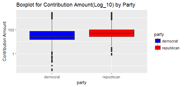
Now it is much better. Although the Republican has the higher median and mean, the Democrat has more variations and the distribution is more spread out. This indicates that the Democrat has more big and small donors.
ggplot(aes(x = cand_nm, y = contb_receipt_amt), data = ma) +
  geom_boxplot() +
  theme(axis.text.x = element_text(angle = 45, hjust = 1)) +
  xlab('candidate') +
  ylab('Contribution Amount') +
  ggtitle('Contribution Amount by Candidate')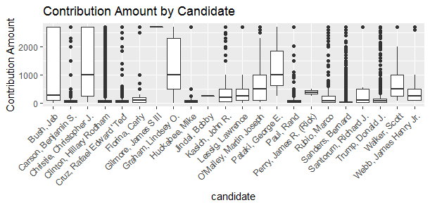
Now the picture looks interesting. Christopher Christie, Lindsey Graham and George Patake have the highest median, Jeb Bush has the greatest interquartile range while Hillary Clinton and Bernard Sanders seem to have the lowest median. But Hillary Clinton has the most outliers(big pocket donors) than anyone else. Bernard Sanders has significant number of outliers as well.
Now let’s examine within parties.
can_group <- group_by(ma, party, cand_nm)
ma.contr_by_can <- summarize(can_group,
                             sum_can = sum(contb_receipt_amt),
                             mean_can = mean(contb_receipt_amt),
                             n = n())
ma.contr_by_can <- arrange(ma.contr_by_can, sum_can)
ggplot(aes(x = cand_nm, y = sum_can/1000), data = ma.contr_by_can) +
  geom_bar(aes(fill = party), stat = 'identity') +
  scale_y_continuous(limits = c(0, 23000)) +
  theme(axis.text.x = element_text(angle = 45, hjust = 1)) +
  xlab('Candidate') +
  ylab('Contribution Received (Thousands)') +
  ggtitle('Contribution Received by Candidate') +
  scale_fill_manual(values = c("blue", "red"))
can_party <- left_join(ma.contr_by_can, ma.contr_by_party, by = 'party')
ggplot(aes(x = cand_nm, y = sum_can/sum_party*100), data = can_party) +
  geom_bar(aes(fill = party), stat = 'identity') +
  geom_text(stat='identity', aes(label = paste(round(100*sum_can/sum_party,0),'%')),
            size=3, data = can_party, vjust = -0.4)+
  scale_y_continuous(limits = c(0, 100)) +
  theme(axis.text.x = element_text(angle = 45, hjust = 1)) +
  xlab('Candidate') +
  ylab('Percentage of Donation') +
  ggtitle('Percentage of Contribution Received by Candidate from their Own Party') +
  scale_fill_manual(values = c("blue", 'red'))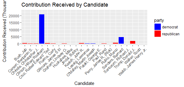
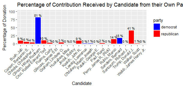
Within each party, majority of the donations were received by only few candidates. For Democratic party, Hillary Clinton and Bernard Sanders take almost 99% of all donations to the Democratic party, and of which, 81% went to Hillary Clinton. For the Republican party, Donald Trump led the way taking 41% of all donations to the Republican party. Donald Trump, Marco Rubio, Ted Cruz, John Kasich, Jeb Bush all together taking 83% of all donations to the Republican party, the remaining 17% were shared by the other 12 Republican candidates.
From the above charts, we are able to see who were the top candidates in each party in Massachusetts. I will examine the following candidates who received at least 9% of total donations in their party in details later.
##[1] "Clinton, Hillary Rodham"   "Sanders, Bernard"
##[3] "Trump, Donald J."          "Rubio, Marco"
##[5] "Cruz, Rafael Edward 'Ted'"
We have seen earlier that women made 26% more number of contributions than men. Is that the same for the amount of money donated? And do women tend to donate more to the liberals and/or to woman candidate?
ggplot(aes(x = gender, y = contb_receipt_amt, fill = gender), data = ma) +
  geom_boxplot() +
  xlab('gender') +
  ylab('Contribution Amount') +
  ggtitle('Contribution Amount by Gender Boxplot') +
  coord_cartesian(ylim = c(0, 100))
by(ma$contb_receipt_amt, ma$gender, summary)
##ma$gender: female
## Min. 1st Qu. Median Mean 3rd Qu. Max.
## 0.0 15.0 27.0 99.8 72.0 2700.0
##---------------------------------------------------------------
##ma$gender: male
## Min. 1st Qu. Median Mean 3rd Qu. Max.
## 0.2 19.0 35.0 131.0 100.0 2700.0 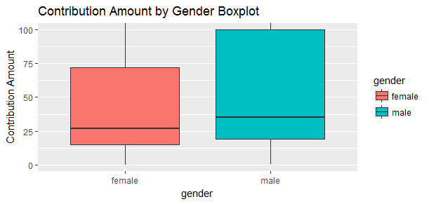
On average, male donated $131 and female donated $99.8, there is a 30% difference between genders. Female contributed much less than male when we look at median, mean and third quartile.
gender_group <- group_by(ma, gender)
ma.contr_by_gen <- summarize(gender_group,
                             sum_gen = sum(contb_receipt_amt),
                             n = n())
ggplot(aes(x = gender, y = sum_gen/1000, fill = gender),
       data = ma.contr_by_gen) +
  geom_bar(stat = 'identity') +
  geom_text(aes(label = sum_gen/1000), stat = 'identity', data = ma.contr_by_gen, vjust = -0.4) +
  xlab('Gender') +
  ylab('Contribution Amount (Thousands)') +
  ggtitle('Contribution Amount by Gender')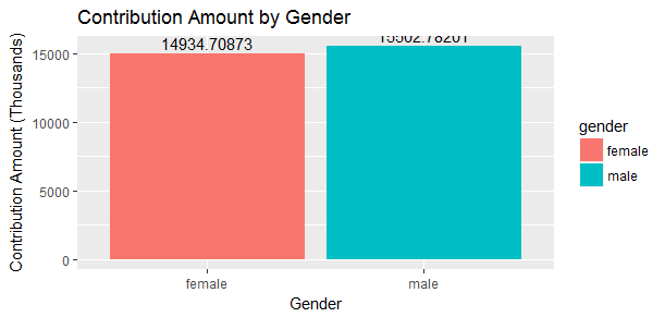
However, when we look at the total contribution amount between genders, they were very close.
ma.gen_to_top_candidate <- ma %>%
  filter(ma$cand_nm %in% top_candidate) %>%
  group_by(cand_nm, gender) %>%
  summarize(sum_gen_can = sum(contb_receipt_amt))
ggplot(aes(x = cand_nm, y = sum_gen_can/1000, fill = gender),
       data = ma.gen_to_top_candidate) +
  geom_bar(stat = 'identity', position = position_dodge(width = 1)) +
  xlab('Candidate') +
  ylab('Contribution Amount (Thousands)') +
  ggtitle('Contribution Amount to Top Candidate by Gender') +
  theme(axis.text.x = element_text(angle = 45, hjust = 1))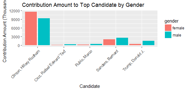
Female in Massachusetts contributed a little less than 15 million US Dollars in total to the presidential campaign in 2016, of which, more than 11 million Dollars went toward Hillary Clinton. This confirms that Massachusetts women donate more to the liberals and/or to woman candidate.
Earlier we have seen that retired people make the most number of contributions, how about total contribution amount and average contribution amount cross top 10 occupations?
ggplot(aes(x = contbr_occupation, y = sum_occu/1000), data = ma.contr_by_occu) +
  geom_bar(stat = 'identity') +
  geom_text(stat = 'identity', aes(label = round(sum_occu/1000)), data = ma.contr_by_occu, vjust = -0.4) +
  xlab('Top 10 Occupations') +
  ylab('Total Contribution Amount (Thousands)') +
  ggtitle('Total Contribution Amount From Top 10 Occupations') +
  theme(axis.text.x = element_text(angle = 45, hjust = 1))
ggplot(aes(x = contbr_occupation, y = round(mean_occu,2)), data = ma.contr_by_occu) +
  geom_bar(stat = 'identity') +
  geom_text(stat = 'identity', aes(label = round(mean_occu,2)), data = ma.contr_by_occu, vjust = -0.4) +
  xlab('Top 10 Occupations') +
  ylab('Average Contribution Amount') +
  ggtitle('Average Contributions From the Top 10 Occupations') +
  theme(axis.text.x = element_text(angle = 45, hjust = 1))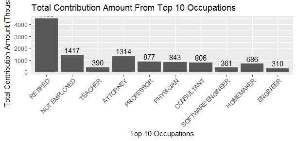
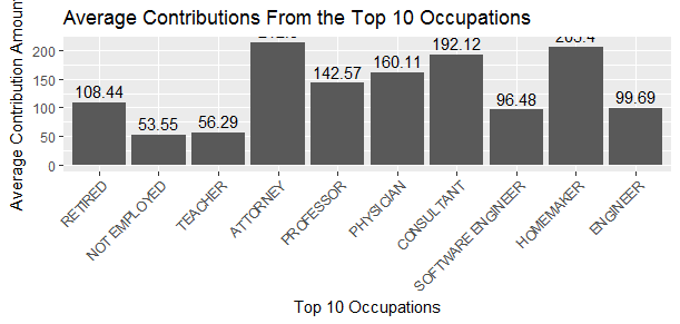
Again, retired people take the first place in terms of total contribution amount followed by not employed people, attorney comes to the third. However, when we look at the average contribution amount, attorney comes to the first, and homemaker takes the second place (presumably most of homemakers are women). Unemployed people contribute the least on average. This does make sense.
Surprisingly, software engineer in Massachusetts has been stingy giving their above average income and long history of reliable source of presidential donations. Perhaps this article can answer my question.
top_occu_df <- filter(ma, contbr_occupation %in% ma.contr_by_occu[['contbr_occupation']])
ggplot(aes(x = contbr_occupation, y = contb_receipt_amt), data = top_occu_df) +
  geom_boxplot() +
  theme(axis.text.x = element_text(angle = 45, hjust = 1)) +
  xlab('Top 10 Occupations') +
  ylab('Donations Amount') +
  ggtitle('Donations Made by Top 10 Occupations')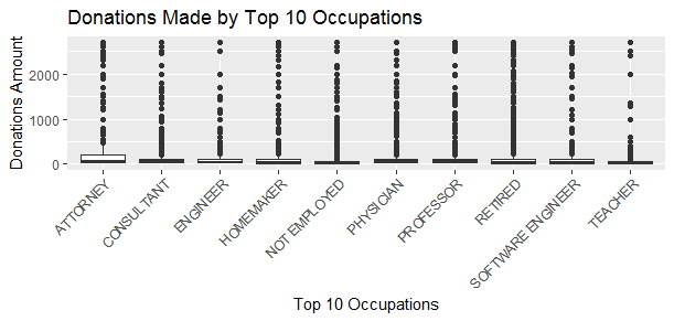
I want to dive deeper to investigate the contribution amount distribution among occupations. a boxplot sounds like a good idea. But this one is hard to see because there are so many outliers.
by(top_occu_df$contb_receipt_amt, top_occu_df$contbr_occupation, summary)
ggplot(aes(x = contbr_occupation, y = contb_receipt_amt), data = top_occu_df) +
  geom_boxplot() +
  theme(axis.text.x = element_text(angle = 45, hjust = 1)) +
  coord_cartesian(ylim = c(0, 200)) +
  xlab('Top 10 Occupations') +
  ylab('Donations Amount') +
  ggtitle('Donations Made by Top 10 Occupations Excl. Outliers')
##top_occu_df$contbr_occupation: ATTORNEY
## Min. 1st Qu. Median Mean 3rd Qu. Max.
## 0 25 50 213 200 2700
##---------------------------------------------------------------
##top_occu_df$contbr_occupation: CONSULTANT
## Min. 1st Qu. Median Mean 3rd Qu. Max.
## 0.2 25.0 50.0 192.0 100.0 2700.0
##---------------------------------------------------------------
##top_occu_df$contbr_occupation: ENGINEER
## Min. 1st Qu. Median Mean 3rd Qu. Max.
## 1.0 25.0 40.5 98.2 100.0 2700.0
##---------------------------------------------------------------
##top_occu_df$contbr_occupation: HOMEMAKER
## Min. 1st Qu. Median Mean 3rd Qu. Max.
## 1 10 25 203 100 2700
##---------------------------------------------------------------
##top_occu_df$contbr_occupation: NOT EMPLOYED
## Min. 1st Qu. Median Mean 3rd Qu. Max.
## 0.0 13.5 27.0 53.6 50.0 2700.0
##---------------------------------------------------------------
##top_occu_df$contbr_occupation: PHYSICIAN
## Min. 1st Qu. Median Mean 3rd Qu. Max.
## 0.4 25.0 50.0 160.0 100.0 2700.0
##---------------------------------------------------------------
##top_occu_df$contbr_occupation: PROFESSOR
## Min. 1st Qu. Median Mean 3rd Qu. Max.
## 0.4 23.0 50.0 142.0 100.0 2700.0
##---------------------------------------------------------------
##top_occu_df$contbr_occupation: RETIRED
## Min. 1st Qu. Median Mean 3rd Qu. Max.
## 0.5 20.0 35.0 108.0 100.0 2700.0
##---------------------------------------------------------------
##top_occu_df$contbr_occupation: SOFTWARE ENGINEER
## Min. 1st Qu. Median Mean 3rd Qu. Max.
## 1.0 15.0 35.0 93.9 100.0 2700.0
##---------------------------------------------------------------
##top_occu_df$contbr_occupation: TEACHER
## Min. 1st Qu. Median Mean 3rd Qu. Max.
## 1.0 15.0 25.0 56.1 50.0 2700.0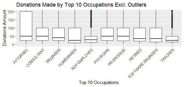
This looks much better. After I filtered out outliers (donations that are extreme high), a boxplot confirms my above observation. The median contribution of teacher, homemaker and unemployed are relatively low.
It is still apparent that attorney made the large contribution with the highest average donation and the largest variability. Some of them contributed 4 times of their respective median.
Some of the interesting findings I observed in this part of the investigation:
- Most of the total contribution in Massachusetts (84%) went toward the Democratic party.
- There were 5 Democratic candidates and 17 Republican candidates. Therefore, there is even bigger difference when we compare average amount between parties.
- Within each party, the majority of contributions are received by a few candidates.
- In Massachusetts there are more female donors than male donors, but female donate much less than male on average.
- In Massachusetts, majority of the contributions from female donors went toward Democratic party and/or woman candidate.
- Retired people contribute the most in total amount, and software engineers and engineers are among the least in total contribution amount.
- Lawyers had the highest average contribution amount and greatest interquartile range, unemployed people have the lowest average contribution amount and one of the smallest interquartile ranges.
- Surprisingly, homemakers had the 2nd highest average contribution amount, but the median contribution in this group is among the lowest. It suggests that the distribution of the data is right skewed with many outliers. Also my presumption is that most of the homemakers are women.
Multivariate Analysis Section
ma.top_candidate <- ma %>%
  filter(cand_nm %in% top_candidate) %>%
  group_by(cand_nm, contb_receipt_dt) %>%
  summarize(n = n(), total = sum(contb_receipt_amt))
ggplot(aes(x = contb_receipt_dt, y = total/1000, color = cand_nm), data = ma.top_candidate) +
  geom_jitter(alpha = 0.05) +
  geom_smooth(method = 'loess') +
  xlab('Date') +
  ylab('Contribution Amount (Thousands)') +
  ggtitle('Time Series of Contribution Amount by Candidate')
ggplot(aes(x = contb_receipt_dt, y = n, color = cand_nm), data = ma.top_candidate) +
  geom_jitter(alpha = 0.05) +
  geom_smooth(method = 'loess') +
  xlab('Date') +
  ylab('Number of Contributions') +
  ggtitle('Time Series of Number of Contributions by Candidate')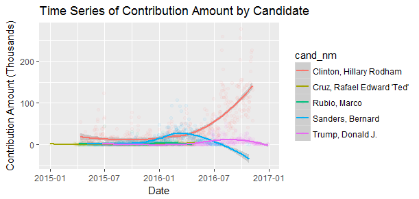
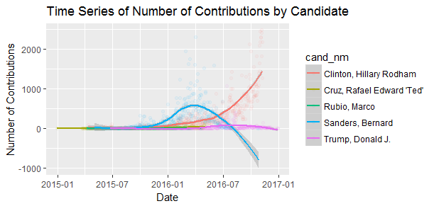
We know that Hillary Clinton raised the most money and had the most supporters in Massachusetts. But is this always true throughout the campaign process? When I look at above 2 graphs, I notice 2 things:
- Bernard Sanders actually raised more money than Hillary Clinton started from January 2016 lasted for a few months.
- Bernard Sanders actually had more supporters than Hillary Clinton from January 2016 onward until June 2016 when he announced to endorse Hillary Clinton that broke his supporters’ hearts.
This only reinforces my doubt that what if Bernard Sanders would have run against Donald Trump? Even Donald Trump himself famously stated the following: I would rather run against Crooked Hillary Clinton than Bernie Sanders and that will happen because the books are cooked against Bernie!
ggplot(aes(x = contb_receipt_dt, y = total, color = cand_nm), data = ma.top_candidate) +
  geom_jitter(alpha = 0.05) +
  geom_smooth(method = 'loess') +
  xlab('Date') +
  ylab('Contribution Amount') +
  ggtitle('Time Series of Contribution Amount(Log_10) by Candidate') +
  facet_wrap(~ cand_nm) +
  scale_y_log10() +
  theme(axis.text.x = element_text(angle = 70, hjust = 1))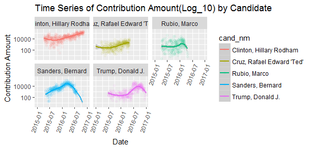
Interesting to see every top candidates’ time series trend. Ted Cruz had a slow and steady growth in contribution amount, that ended as soon as he suspended his campaign in May 2016. Marco Rubio dopped out even earlier in March 2016. Donald Trump’s contribution donation had a steady growth until around September 2016. His campaign probably did not spend a lot of money in Massachusetts.
As a side note, although Donald Trump did not win in Massachusetts, A Third of Massachusetts Voters Picked Trump and The Trump effect happened in Massachusetts, too.
Where do those donors reside?
lat <- ma$latitude
lon <- ma$longitude
party <- ma$party
ma_map <- data.frame(party, lat, lon)
colnames(ma_map) <- c('party', 'lat', 'lon')
sbbox <- make_bbox(lon = ma$lon, lat = ma$lat, f = 0.01)
my_map <- get_map(location = sbbox, maptype = "roadmap", scale = 2, color="bw", zoom = 7)
ggmap(my_map) +
  geom_point(data=ma_map, aes(x = lon, y = lat, color = party),
             size = 2, alpha = 0.2) +
  xlab('Longitude') +
  ylab('Latitude') +
  ggtitle('Location of Donors') +
  scale_y_continuous(limits = c(41, 43)) +
  scale_x_continuous(limits = c(-74, -70)) +
  scale_color_manual(breaks=c("democrat", "republican"), values=c("blue","red"))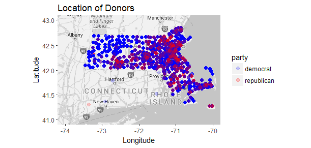
It looks like more republicans concentrated around Boston area, this does make sense as Boston is the largest city in Massachusetts. But look, how blue the state is!
Predictive Modeling
In this section, I will attempt to apply logistic regression method to predict a donor’s contributing party giving his (or her) location (latitude, longitude), gender and donation amount. I will be taking the following steps:
- Subset the original dataset selecting the relevant columns only and make sure to filter out the ‘other’ party.
- Clean and format data.
- Remove negative sign in longitude for calculations.
- Create a model to predict a donor’s contributing party based on gender, latitude, longitude and contribution receipt amount.
data <- subset(ma,select=c(10, 19, 21, 25, 26))
data <- filter(data, party %in% c('democrat', 'republican'))
data$party <- as.factor(data$party)
data$gender <- as.factor(data$gender)
data$longitude <- abs(data$longitude)
train <- data[1:240000,]
test <- data[240001:267914,]
model <- glm(party ~.,family=binomial(link='logit'),data=train)
summary(model)
##Call:
##glm(formula = party ~ ., family = binomial(link = "logit"), data = train)
##Deviance Residuals:
## Min 1Q Median 3Q Max
##-1.199 -0.526 -0.347 -0.323 2.642
##Coefficients:
## Estimate Std. Error z value Pr(>|z|)
##(Intercept) 35.2033169 1.2057485 29.20 < 0.0000000000000002 ***
##contb_receipt_amt 0.0003798 0.0000154 24.59 < 0.0000000000000002 ***
##gendermale 0.9999550 0.0147512 67.79 < 0.0000000000000002 ***
##latitude -0.7498591 0.0275146 -27.25 < 0.0000000000000002 ***
##longitude -0.0889563 0.0123258 -7.22 0.00000000000053 ***
##---
##Signif. codes: 0 ‘***’ 0.001 ‘**’ 0.01 ‘*’ 0.05 ‘.’ 0.1 ‘ ’ 1
##(Dispersion parameter for binomial family taken to be 1)
## Null deviance: 150246 on 239877 degrees of freedom
##Residual deviance: 143860 on 239873 degrees of freedom
## (122 observations deleted due to missingness)
##AIC: 143870
##Number of Fisher Scoring iterations: 5Interpreting the Results of the Logistic Regression Model
- For a one unit increase in latitude, the log odds of contributing to Republican decreases by 0.75.
- For a one unit increase in abs(longitude), the log odds of contributing to Republican decreases by 0.09.
- For a one unit increase in contribution amount, the log odds of contributing to Republican increase by 0.0004.
- If all other variables being equal, the male donor is more likely to contribute to Republican.
Assessing the predictive Ability of the Model
model_pred_prob <- predict(model, test, type='response')
model_pred_direction <- rep('democrat', nrow(test))
model_pred_direction[model_pred_prob > 0.5] = 'republican'
table(model_pred_direction, test$party)
misClasificError <- mean(model_pred_direction != test$party)
print(paste('Accuracy',1-misClasificError))
##model_pred_direction democrat republican
## democrat 26150 1761
## republican 0 3##[1] "Accuracy 0.936913376800172"Wow! The 0.94 accuracy on the test set is a very good result. However, this result is based on the mannul split of the data I created earlier. It may not be precise enough.
Some of the relationships I observed in this part of the investigation:
- While closer to the election, more big pocket donors supported Hillary Clinton.
- While closer to the election, less donation went toward Donald Trump.
- For a certain period of time, Bernard Sanders received more donations and gained more popularity than Hillary Clinton.
Conclusion
By analyzing Massachusetts financial donation data, I found several interesting characteristics:
- It is no doubt that Massachusetts is one of the bluest states.
- Few candidates collected the most donations.
- Female tend to donate more to liberals and/or to female candidate.
- The retired people are the largest contribution group, and software engineers make very small contributions considering Boston is among the best-paying cities for software engineers.
- Bernard Sanders gained more popularity than Hillary Clinton until he gave up his run.
Future Work
The analysis I conducted is for Massachusetts state only. It would be interesting to analyze campaign finance data for some swing states such as Ohio or Florida, as well as campaign finance data nationwide. I am sure the picture would be very different.
Although the election is over, Americans have seen the post-election surge in donations. There will be more interesting financial contribution data to analyze.
Source code that created this post can be found here. I am happy to hear any feedback and questions.