
The Happy Planet Index (HPI) is an index of human well-being and environmental impact that was introduced by NEF, a UK-based economic think tank promoting social, economic and environmental justice. The index is weighted to give progressively higher scores to nations with lower ecological footprints. I downloaded the 2016 dataset from HPI website. My goal is to find correlations between several variables, then use clustering technic to seprarate these 140 countries into different clusters, according to happiness, wealth, life expectancy and carbon emissions.
library(xlsx)
hpi <- read.xlsx('hpi-data-2016.xlsx',sheetIndex = 5, header = TRUE)
Load the packages
library(dplyr)
library(plotly)
library(stringr)
library(cluster)
library(FactoMineR)
library(factoextra)
library(ggplot2)
library(reshape2)
library(ggthemes)
library(NbClust)
Data Pre-processing
# Remove the unnecessary columns
hpi <- hpi[c(3:14)]
# remove footer
hpi <- hpi[-c(141:158), ]
# rename columns
hpi <- hpi[,c(grep('Country', colnames(hpi)), grep('Region', colnames(hpi)), grep('Happy.Planet.Index', colnames(hpi)), grep('Average.Life..Expectancy', colnames(hpi)), grep('Happy.Life.Years', colnames(hpi)), grep('Footprint..gha.capita.', colnames(hpi)), grep('GDP.capita...PPP.', colnames(hpi)), grep('Inequality.of.Outcomes', colnames(hpi)), grep('Average.Wellbeing..0.10.', colnames(hpi)), grep('Inequality.adjusted.Life.Expectancy', colnames(hpi)), grep('Inequality.adjusted.Wellbeing', colnames(hpi)), grep('Population', colnames(hpi)))]
names(hpi) <- c('country', 'region','hpi_index', 'life_expectancy', 'happy_years', 'footprint', 'gdp', 'inequality_outcomes', 'wellbeing', 'adj_life_expectancy', 'adj_wellbeing', 'population')
# change data type
hpi$country <- as.character(hpi$country)
hpi$region <- as.character(hpi$region)
The structure of the data
str(hpi)##'data.frame': 140 obs. of 12 variables:
## $ country : chr "Afghanistan" "Albania" "Algeria" "Argentina" ##...
## $ region : chr "Middle East and North Africa" "Post-communist" ##"Middle East and North Africa" "Americas" ...
## $ hpi_index : num 20.2 36.8 33.3 35.2 25.7 ...
## $ life_expectancy : num 59.7 77.3 74.3 75.9 74.4 ...
## $ happy_years : num 12.4 34.4 30.5 40.2 24 ...
## $ footprint : num 0.79 2.21 2.12 3.14 2.23 9.31 6.06 0.72 5.09 ##7.44 ...
## $ gdp : num 691 4247 5584 14357 3566 ...
## $ inequality_outcomes: num 0.427 0.165 0.245 0.164 0.217 ...
## $ wellbeing : num 3.8 5.5 5.6 6.5 4.3 7.2 7.4 4.7 5.7 6.9 ...
## $ adj_life_expectancy: num 38.3 69.7 60.5 68.3 66.9 ...
## $ adj_wellbeing : num 3.39 5.1 5.2 6.03 3.75 ...
## $ population : num 29726803 2900489 37439427 42095224 2978339 ...The summary of the data
summary(hpi[, 3:12])## hpi_index life_expectancy happy_years footprint
## Min. :12.78 Min. :48.91 Min. : 8.97 Min. : 0.610
## 1st Qu.:21.21 1st Qu.:65.04 1st Qu.:18.69 1st Qu.: 1.425
## Median :26.29 Median :73.50 Median :29.40 Median : 2.680
## Mean :26.41 Mean :70.93 Mean :30.25 Mean : 3.258
## 3rd Qu.:31.54 3rd Qu.:77.02 3rd Qu.:39.71 3rd Qu.: 4.482
## Max. :44.71 Max. :83.57 Max. :59.32 Max. :15.820
## gdp inequality_outcomes wellbeing adj_life_expectancy
## Min. : 244.2 Min. :0.04322 Min. :2.867 Min. :27.32
## 1st Qu.: 1628.1 1st Qu.:0.13353 1st Qu.:4.575 1st Qu.:48.21
## Median : 5691.1 Median :0.21174 Median :5.250 Median :63.41
## Mean : 13911.1 Mean :0.23291 Mean :5.408 Mean :60.34
## 3rd Qu.: 15159.1 3rd Qu.:0.32932 3rd Qu.:6.225 3rd Qu.:72.57
## Max. :105447.1 Max. :0.50734 Max. :7.800 Max. :81.26
## adj_wellbeing population
## Min. :2.421 Min. :2.475e+05
## 1st Qu.:4.047 1st Qu.:4.248e+06
## Median :4.816 Median :1.065e+07
## Mean :4.973 Mean :4.801e+07
## 3rd Qu.:5.704 3rd Qu.:3.343e+07
## Max. :7.625 Max. :1.351e+09ggplot(hpi, aes(x=gdp, y=life_expectancy)) +
geom_point(aes(size=population, color=region)) + coord_trans(x = 'log10') +
geom_smooth(method = 'loess') + ggtitle('Life Expectancy and GDP per Capita in USD log10') + theme_classic()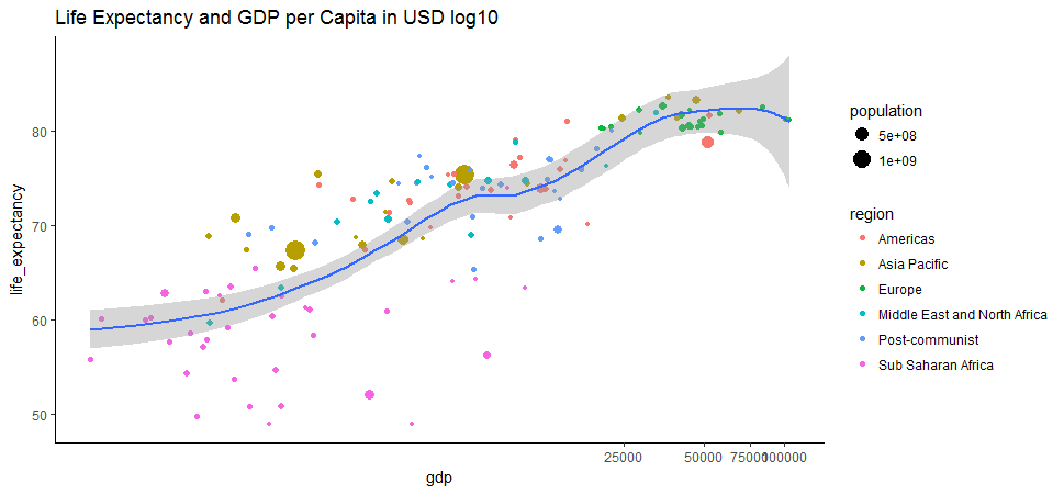
After log transformation, the relationship between GDP per capita and life expectancy is more clear and looks relatively strong. These two variables are concordant. The Pearson correlation between this two variable is reasonably high, at approximate 0.62.
cor.test(hpi$gdp, hpi$life_expectancy)## Pearson's product-moment correlation
##data: hpi$gdp and hpi$life_expectancy
##t = 9.3042, df = 138, p-value = 2.766e-16
##alternative hypothesis: true correlation is not equal to 0
##95 percent confidence interval:
## 0.5072215 0.7133067
##sample estimates:
## cor
##0.6208781 ggplot(hpi, aes(x=life_expectancy, y=hpi_index)) +
geom_point(aes(size=population, color=region)) + geom_smooth(method = 'loess') + ggtitle('Life Expectancy and Happy Planet Index Score') + theme_classic()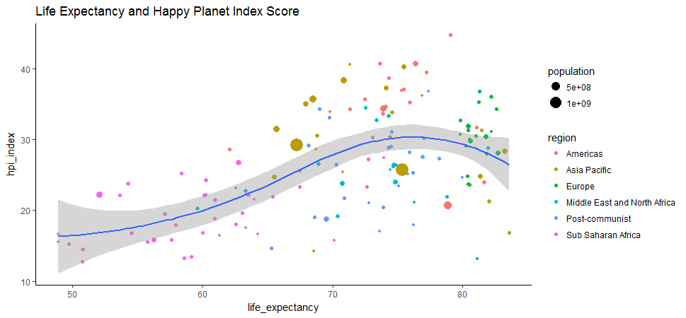
Many countries in Europe and Americas end up with middle-to-low HPI index probably because of their big carbon footprints, despite long life expectancy.
ggplot(hpi, aes(x=gdp, y=hpi_index)) + geom_point(aes(size=population, color=region)) + geom_smooth(method = 'loess') + ggtitle('GDP per Capita(log10) and Happy Planet Index Score') + coord_trans(x = 'log10')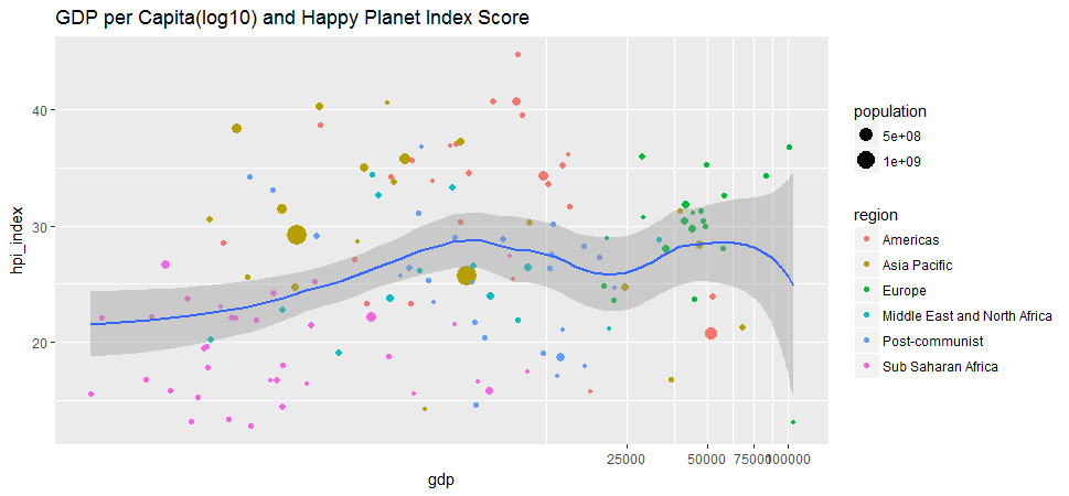
GDP can’t buy happiness. The correlation between GDP and Happy Planet Index score is indeed very low, at about 0.11.
cor.test(hpi$gdp, hpi$hpi_index)## Pearson's product-moment correlation
##data: hpi$gdp and hpi$hpi_index
##t = 1.3507, df = 138, p-value = 0.179
##alternative hypothesis: true correlation is not equal to 0
##95 percent confidence interval:
## -0.05267424 0.27492060
##sample estimates:
## cor
##0.1142272 Always(almost) scale the data.
An important step of meaningful clustering consists of transforming the variables such that they have mean zero and standard deviation one.
hpi[, 3:12] <- scale(hpi[, 3:12])
summary(hpi[, 3:12])
## hpi_index life_expectancy happy_years footprint
## Min. :-1.86308 Min. :-2.5153 Min. :-1.60493 Min. :-1.1493
## 1st Qu.:-0.71120 1st Qu.:-0.6729 1st Qu.:-0.87191 1st Qu.:-0.7955
## Median :-0.01653 Median : 0.2939 Median :-0.06378 Median :-0.2507
## Mean : 0.00000 Mean : 0.0000 Mean : 0.00000 Mean : 0.0000
## 3rd Qu.: 0.70106 3rd Qu.: 0.6968 3rd Qu.: 0.71388 3rd Qu.: 0.5317
## Max. : 2.50110 Max. : 1.4449 Max. : 2.19247 Max. : 5.4532
## gdp inequality_outcomes wellbeing adj_life_expectancy
## Min. :-0.6921 Min. :-1.5692 Min. :-2.2128 Min. :-2.2192
## 1st Qu.:-0.6220 1st Qu.:-0.8222 1st Qu.:-0.7252 1st Qu.:-0.8152
## Median :-0.4163 Median :-0.1751 Median :-0.1374 Median : 0.2060
## Mean : 0.0000 Mean : 0.0000 Mean : 0.0000 Mean : 0.0000
## 3rd Qu.: 0.0632 3rd Qu.: 0.7976 3rd Qu.: 0.7116 3rd Qu.: 0.8221
## Max. : 4.6356 Max. : 2.2702 Max. : 2.0831 Max. : 1.4059
## adj_wellbeing population
## Min. :-2.1491 Min. :-0.2990
## 1st Qu.:-0.7795 1st Qu.:-0.2740
## Median :-0.1317 Median :-0.2339
## Mean : 0.0000 Mean : 0.0000
## 3rd Qu.: 0.6162 3rd Qu.:-0.0913
## Max. : 2.2339 Max. : 8.1562 A simple correlation heatmap
qplot(x=Var1, y=Var2, data=melt(cor(hpi[, 3:12], use="p")), fill=value, geom="tile") +
  scale_fill_gradient2(limits=c(-1, 1)) +
  theme(axis.text.x = element_text(angle = 90, hjust = 1)) +
             labs(title="Heatmap of Correlation Matrix",
                  x=NULL, y=NULL)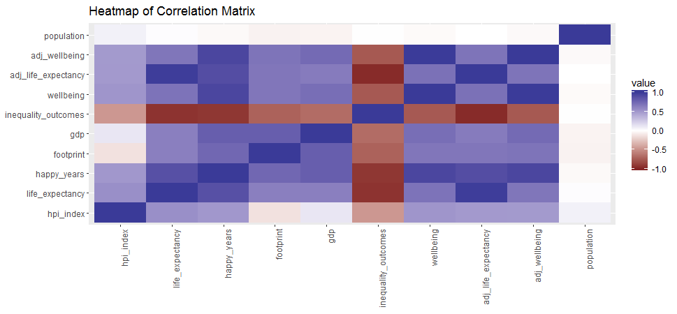
Principal Component Analysis (PCA)
PCA is a procedure for identifying a smaller number of uncorrelated variables, called “principal components”, from a large set of data. The goal of principal components analysis is to explain the maximum amount of variance with the minimum number of principal components.
hpi.pca <- PCA(hpi[, 3:12], graph=FALSE)
print(hpi.pca)
##**Results for the Principal Component Analysis (PCA)**
##The analysis was performed on 140 individuals, described by 10 variables
##*The results are available in the following objects:
## name description
##1 "$eig" "eigenvalues"
##2 "$var" "results for the variables"
##3 "$var$coord" "coord. for the variables"
##4 "$var$cor" "correlations variables - dimensions"
##5 "$var$cos2" "cos2 for the variables"
##6 "$var$contrib" "contributions of the variables"
##7 "$ind" "results for the individuals"
##8 "$ind$coord" "coord. for the individuals"
##9 "$ind$cos2" "cos2 for the individuals"
##10 "$ind$contrib" "contributions of the individuals"
##11 "$call" "summary statistics"
##12 "$call$centre" "mean of the variables"
##13 "$call$ecart.type" "standard error of the variables"
##14 "$call$row.w" "weights for the individuals"
##15 "$call$col.w" "weights for the variables" eigenvalues <- hpi.pca$eig
head(eigenvalues)## eigenvalue percentage of variance cumulative percentage of variance
##comp 1 6.66741533 66.6741533 66.67415
##comp 2 1.31161290 13.1161290 79.79028
##comp 3 0.97036077 9.7036077 89.49389
##comp 4 0.70128270 7.0128270 96.50672
##comp 5 0.24150648 2.4150648 98.92178
##comp 6 0.05229306 0.5229306 99.44471Interpretation:
-
The proportion of variation retained by the principal components was extracted above.
-
eigenvalues is the amount of variation retained by each PC. The first PC corresponds to the maximum amount of variation in the data set. In this case, the first two principal components are worthy of consideration because A commonly used criterion for the number of factors to rotate is the eigenvalues-greater-than-one rule proposed by Kaiser (1960).
fviz_screeplot(hpi.pca, addlabels = TRUE, ylim = c(0, 65))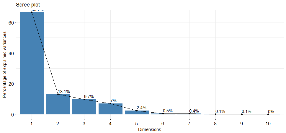
The scree plot shows us which components explain most of the variability in the data. In this case, almost 80% of the variances contained in the data are retained by the first two principal components.
head(hpi.pca$var$contrib)## Dim.1 Dim.2 Dim.3 Dim.4 Dim.5
##hpi_index 3.571216 50.96354921 5.368971166 2.1864830 5.28431372
##life_expectancy 12.275001 2.29815687 0.002516184 18.4965447 0.31797242
##happy_years 14.793710 0.01288175 0.027105103 0.7180341 0.03254368
##footprint 9.021277 24.71161977 2.982449522 0.4891428 7.62967135
##gdp 9.688265 11.57381062 1.003632002 2.3980025 72.49799232
##inequality_outcomes 13.363651 0.30494623 0.010038818 9.7957329 2.97699333-
Variables that are correlated with PC1 and PC2 are the most important in explaining the variability in the data set.
-
The contribution of variables was extracted above: The larger the value of the contribution, the more the variable contributes to the component.
fviz_pca_var(hpi.pca, col.var="contrib",
             gradient.cols = c("#00AFBB", "#E7B800", "#FC4E07"),
             repel = TRUE
             )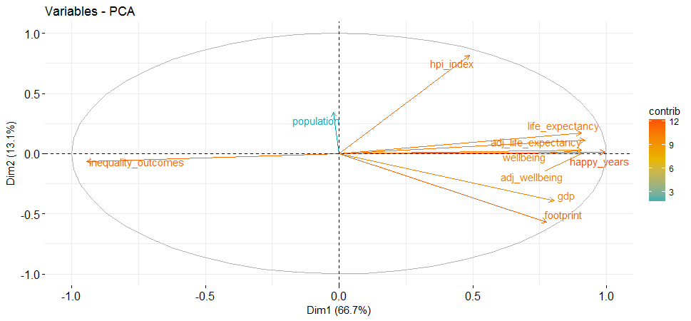
This highlights the most important variables in explaining the variations retained by the principal components.
Using Pam Clustering Analysis to group countries by wealth, development, carbon emissions, and happiness.
When using clustering algorithms, k must be specified by the analyst. I use the following method to help finding the best k.
number <- NbClust(hpi[, 3:12], distance="euclidean",
               min.nc=2, max.nc=15, method='ward.D', index='all', alphaBeale = 0.1)
##*** : The Hubert index is a graphical method of determining the number of ##clusters.
## In the plot of Hubert index, we seek a significant knee that ##corresponds to a
## significant increase of the value of the measure i.e the ##significant peak in Hubert
## index second differences plot.
##*** : The D index is a graphical method of determining the number of ##clusters.
## In the plot of D index, we seek a significant knee (the ##significant peak in Dindex
## second differences plot) that corresponds to a significant ##increase of the value of
## the measure.
##*******************************************************************
##* Among all indices:
##* 4 proposed 2 as the best number of clusters
##* 7 proposed 3 as the best number of clusters
##* 1 proposed 5 as the best number of clusters
##* 5 proposed 6 as the best number of clusters
##* 3 proposed 10 as the best number of clusters
##* 3 proposed 15 as the best number of clusters
## ***** Conclusion *****
##* According to the majority rule, the best number of clusters is 3 I will apply K=3 in the following steps.
set.seed(2017)
pam <- pam(hpi[, 3:12], diss=FALSE, 3, keep.data=TRUE)
fviz_silhouette(pam)
## cluster size ave.sil.width
##1 1 43 0.46
##2 2 66 0.32
##3 3 31 0.37Number of countries assigned in each cluster.
hpi$country[pam$id.med]##[1] "Liberia" "Romania" "Ireland"This prints out one typical country represents each cluster.
fviz_cluster(pam, stand = FALSE, geom = "point",
             ellipse.type = "norm")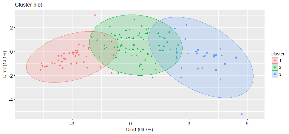
It is always a good idea to look at the cluster results, see how these three clusters were assigned.
A World map of three clusters
hpi['cluster'] <- as.factor(pam$clustering)
map <- map_data("world")
map <- left_join(map, hpi, by = c('region' = 'country'))
ggplot() + geom_polygon(data = map, aes(x = long, y = lat, group = group, fill=cluster, color=cluster)) +
  labs(title = "Clustering Happy Planet Index", subtitle = "Based on data from:http://happyplanetindex.org/", x=NULL, y=NULL) + theme_minimal()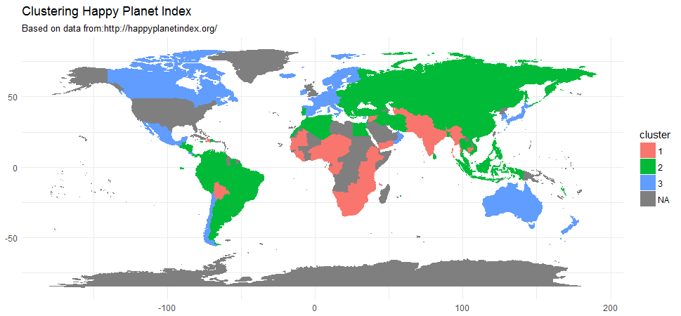
Source code that created this post can be found here. I am happy to hear any feedback or questions.
References: