
Don’t want to be nailed? The City of Toronto publishes their parking tickets data every year. Below is one year parking tickets data to show you when and where most tickets are issued.
I will be using R and some of its extended libraries for this project.
data1 <- read.csv('Parking_Tags_Data_2016_1.csv', stringsAsFactors = F)
data2 <- read.csv('Parking_Tags_Data_2016_2.csv', stringsAsFactors = F)
data3 <- read.csv('Parking_Tags_Data_2016_3.csv', stringsAsFactors = F)
data4 <- read.csv('Parking_Tags_Data_2016_4.csv', stringsAsFactors = F)
parking_df <- rbind(data1, data2, data3, data4)dim(parking_df)The dataset can be accessed through City of Toronto Open Data Portal. It contains 2256761 parking tickets, from January 1 2016 to December 31 2016, the amount from 0 to $450. I will omit missing values in the data, that means 1331 rows are omitted. Also I will need to do some cleaning such as change the date and time format to the appropriate format. I also added a new column - day of week.
parking_df$time_of_infraction <- sprintf("%04d", parking_df$time_of_infraction)
parking_df$time_of_infraction <- format(strptime(parking_df$time_of_infraction, format="%H%M"), format = "%H:%M")
parking_df <- parking_df[complete.cases(parking_df[,-1]),]

library(ggplot2)
ggplot(aes(x = date_of_infraction), data = parking_df) + geom_histogram(bins = 48, color = 'black', fill = 'gold') +
  ggtitle('Histogram of Infraction Date')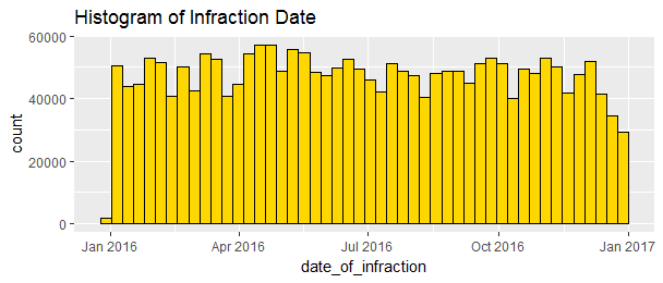
The number of parking tickets distributed almost evenly throughout the year. It seems slowing down towards the end of the year.
parking_df$time_of_infraction <- as.POSIXlt(parking_df$time_of_infraction, format="%H:%M")$hour

ggplot(aes(x = time_of_infraction), data = parking_df) + geom_histogram(bins = 24, color = 'black', fill = 'blue') +
  ggtitle('Histogram of Infraction Time')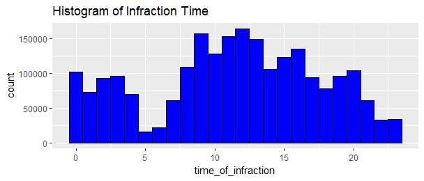
The time distribution appears bimodal with period peaking around 9am to 1pm and again after midnight. The safest time to park your car without being nailed is around 5 and 6am.
sort(table(parking_df$set_fine_amount))

ggplot(aes(x = set_fine_amount), data = parking_df) + geom_histogram(bins = 100, color = 'black', fill = 'red') +
  ggtitle('Histogram of Fine Amount')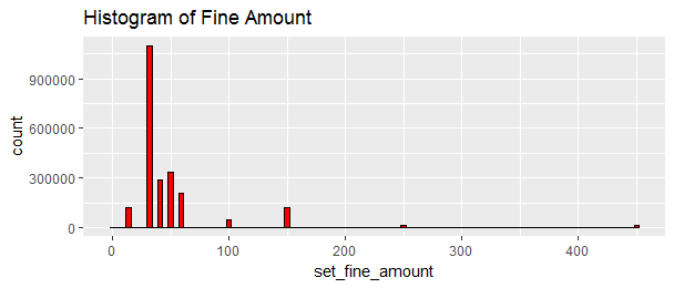
##     200    55       0     300      90     250     450     100      15     150
##      3     177     210     881     920   14655   16029   46356  119410  119615
##     60      40      50      30
## 211209  286409  337904 1099652
The most common amount is $30, then $50, then $40. I believe the “0” value means the parking tickets were cancelled.
So which dates have the most number of infractions? and which dates have the least number of infractions?
library(dplyr)
parking_df_day <- dplyr::summarise(date_group, count = n(),
                                   total_day = sum(set_fine_amount),
                                   na.rm = TRUE)
parking_df_day[order(parking_df_day$count),]
## A tibble: 366 × 4
## date_of_infraction count total_day na.rm
## <date> <int> <int> <lgl>
##1 2016-12-25 725 32405 TRUE
##2 2016-12-26 1031 59055 TRUE
##3 2016-01-01 1635 87380 TRUE
##4 2016-10-10 2303 116485 TRUE
##5 2016-12-17 2354 121890 TRUE
##6 2016-03-25 2498 115310 TRUE
##7 2016-02-15 2526 128110 TRUE
##8 2016-03-28 2555 113030 TRUE
##9 2016-03-27 2586 113160 TRUE
##10 2016-07-01 2929 148035 TRUE
## ... with 356 more rowsDecember 25 has the least number of parking tickets issued. I wonder why.
Time to add day of week column.
parking_df$day_of_week <- weekdays(as.Date(parking_df$date_of_infraction))
weekday_group <- group_by(parking_df, day_of_week)
parking_df_weekday <- dplyr::summarise(weekday_group, count = n(),
                                       total_day = sum(set_fine_amount))

parking_df_weekday$day_of_week <- ordered(parking_df_weekday$day_of_week, levels = c('Monday', 'Tuesday', 'Wednesday', 'Thursday', 'Friday', 'Saturday', 'Sunday'))
ggplot(aes(x = day_of_week, y = count), data = parking_df_weekday) +
  geom_bar(stat = 'identity') +
  ylab('Number of Infractions') +
  ggtitle('Infractions Day of Week')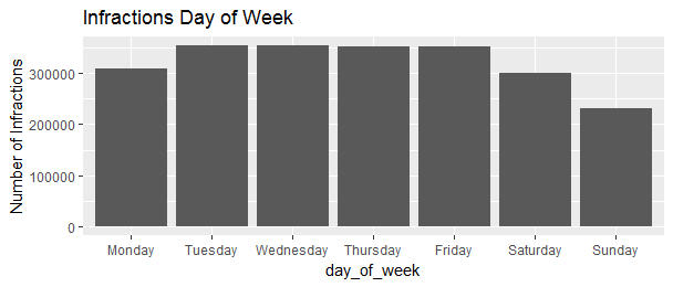
Apparently, less infractions happened in the weekend than during the weekdays.
Now let’s look at what the infractions are. Because there are more than 200 different infractions, it makes sense to only look at the top 10.
infraction_group <- group_by(parking_df, infraction_description, infraction_code)
parking_df_infr <- dplyr::summarise(infraction_group, count = n())
parking_df_infr <- head(parking_df_infr[order(parking_df_infr$count, decreasing = TRUE),], n = 10)

library(ggthemes)
ggplot(aes(x = reorder(infraction_description, count), y = count), data = parking_df_infr) +
  geom_bar(stat = 'identity') +
  theme_tufte() +
  theme(axis.text = element_text(size = 10, face = 'bold')) +
  coord_flip() +
  xlab('') +
  ylab('Total Number of Infractions') +
  ggtitle("Top 10 Infractions") +
  theme_fivethirtyeight()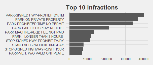
Now, what are the top 10 locations that have the most infractions?
library(dplyr)
location_group <- group_by(parking_df, location2)
parking_df_lo <- dplyr::summarise(location_group, total = sum(set_fine_amount),
                                  count = n())
parking_df_lo <- head(parking_df_lo[order(parking_df_lo$count, decreasing = TRUE), ], n=10)

ggplot(aes(x = reorder(location2, count), y = count), data = parking_df_lo) +
  geom_bar(stat = 'identity') +
  theme_tufte() +
  theme(axis.text = element_text(size = 10, face = 'bold')) +
  coord_flip() +
  xlab('') +
  ylab('Total Number of Infractions') +
  ggtitle("Top 10 Locations") +
  theme_fivethirtyeight()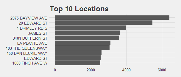
Here it is! Be aware when you are around those areas.
How about the trend? Is there any infraction type increase or decrease over time?
parking_df_infr_1 <- parking_df %>%
  filter(infraction_description %in% parking_df_infr$infraction_description)
date_in_group <- group_by(parking_df_infr_1, infraction_description, date_of_infraction)
parking_df_infr_1 <- dplyr::summarise(date_in_group, total =
                                      sum(set_fine_amount),
                                      count = n())
ggplot(aes(x = date_of_infraction, y = count, color = infraction_description), data = parking_df_infr_1) +
  geom_jitter(alpha = 0.05) +
  geom_smooth(method = 'loess') +
  xlab('Date') +
  ylab('Number of Infractions') +
  ggtitle('Time Series of the Top Infractions') +
  scale_y_log10() +
  theme_solarized()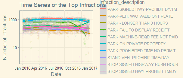
This is not a good looking graph. Most of the top infractions have been steady over time. only “PARK FAIL TO DISPLAY RECEIPT” had dropped since fall, and “PARK MACHINE-REQD FEE NOT PAID” had an increase since October. Does it have anything to do with the season? or weather? Or simply more park machines broken toward the end of the year?
week_time_group <- group_by(parking_df, day_of_week, time_of_infraction)
parking_df_week_time <- dplyr::summarise(week_time_group, time_sum =
                                      sum(set_fine_amount),
                                      count = n())
parking_df_week_time$day_of_week <- ordered(parking_df_week_time$day_of_week, levels = c('Monday', 'Tuesday', 'Wednesday', 'Thursday', 'Friday', 'Saturday', 'Sunday'))
ggplot(aes(x = time_of_infraction, y = count, color = day_of_week), data = parking_df_week_time) +
  geom_line(size = 2.5, alpha = 0.7) +
  geom_point(size = 0.5) +
  xlab('Hour(24 hour clock)') +
  ylab('Number of Infractions') +
  ggtitle('Infractions Time of the Day') +
  theme_economist()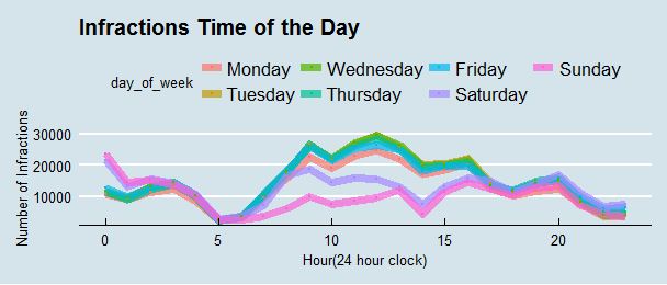
This is a much better looking graph. the highest counts are around noon time during the weekday, this trend changed during the weekend.
Finally, let’s look at each of the top 10 infractions, how do they change during the time of the day.
top_10 <- c('PARK-SIGNED HWY-PROHIBIT DY/TM', 'PARK ON PRIVATE PROPERTY', 'PARK PROHIBITED TIME NO PERMIT', 'PARK FAIL TO DISPLAY RECEIPT', 'PARK MACHINE-REQD FEE NOT PAID', 'PARK - LONGER THAN 3 HOURS ', 'STOP-SIGNED HWY-PROHIBIT TM/DY', 'STAND VEH.-PROHIBIT TIME/DAY', 'STOP-SIGNED HIGHWAY-RUSH HOUR', 'PARK-VEH. W/O VALID ONT PLATE')
parking_df_top_10 <- parking_df %>%
  filter(infraction_description %in% top_10)
top_10_groups <- group_by(parking_df_top_10, infraction_description, day_of_week, time_of_infraction)
parking_df_top_10 <- dplyr::summarise(top_10_groups, total =
                                      sum(set_fine_amount),
                                      count = n())
parking_df_top_10$day_of_week <- ordered(parking_df_top_10$day_of_week, levels = c('Monday', 'Tuesday', 'Wednesday', 'Thursday', 'Friday', 'Saturday', 'Sunday'))
ggplot(aes(x = time_of_infraction, y = count, color = day_of_week), data = parking_df_top_10) +
  geom_line(size = 1.5) +
  geom_point(size = 0.5) +
  xlab('Hour(24 hour clock)') +
  ylab('Number of Infractions') +
  ggtitle('(log_10)Infractions Time of the Day') +
  scale_y_log10() +
  facet_wrap(~infraction_description)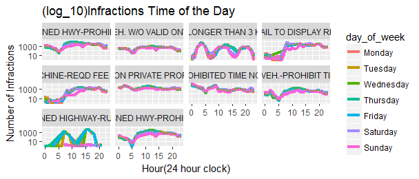
I found two sharp curved infractions interesting, one is “STOP-SIGNED HIGHWAY RUSH-HOUR”, there are two peak infraction hours around 8am and 4pm during the weekdays, the weekend is very quiet. It makes sense as it labels as “RUSH-HOUR”. Another is ‘PARK-LONGER THAN 3 HOURS’, this is the only infractions happened more during the early hours around 4am, this applies to weekends as well as weekdays.
It seems to me that residents live in an appartment building without a garage will be ticketed for overnight parking on their street if their street has no on-street permits. That’s why most of the infractions happened in the early hours of the day.
The above analysis doesn’t represent all the problems and areas since not every illegally parked car will be reported. It does give a general idea and might start a conversation on how and where the City of Toronto should intervene.
Source code used to created this post can be found here.