
I have been exploring Toronto’s Open Data Catalogue, but I have to admit that it is not always easy to find interesting dataset. Today, this water consumption by ward 2000 to 2015 dataset got my attention. To put things in perspective, I will only look into the data for the past five years.
As usual, download dateset, check missing values and do some wrangling. There are five columns that I do not need, I decided to remove them.
library(xlsx)
library(ggplot2)
library(ggthemes)
library(gridExtra)
library(reshape2)
water2011 <- read.xlsx('water_consumption_2011.xls', sheetIndex = 1)
water2012 <- read.xlsx('water_consumption_2012.xls', sheetIndex = 1)
water2013 <- read.xlsx('water_consumption_2013.xls', sheetIndex = 1)
water2014 <- read.xlsx('water_consumption_2014.xls', sheetIndex = 1)
water2015 <- read.xlsx('water_consumption_2015.xls', sheetIndex = 1)
water <- rbind(water2011, water2012, water2013, water2014, water2015)
water$year <- as.numeric(as.character(water$year))
water <- water[complete.cases(water[,-1]),]
water$residential.accounts <- NULL
water$total.consumption <- NULL
water$average.consumption <- NULL
water$commercial.accounts <- NULL
water$total.count <- NULL
p1 <- ggplot(aes(x = city.ward, y = annual.residential.usage), data = water) +
  geom_line(size = 2) +
  scale_x_continuous(breaks = seq(1, 45, 1)) +
  ylab('Water Usage(in cubic meters)') +
  ggtitle('Total Residential Usage by Ward 2011 - 2015') +
  theme_economist()
p2 <- ggplot(aes(x = city.ward, y = annual.commercial.usage), data=water) +
  geom_line(size = 2) +
  scale_x_continuous(breaks = seq(1, 45, 1)) +
  ylab('Water Usage(in cubic meters)') +
  ggtitle('Total Commercial Usage by Ward 2011 - 2015') +
  theme_economist()
grid.arrange(p1, p2, ncol=1)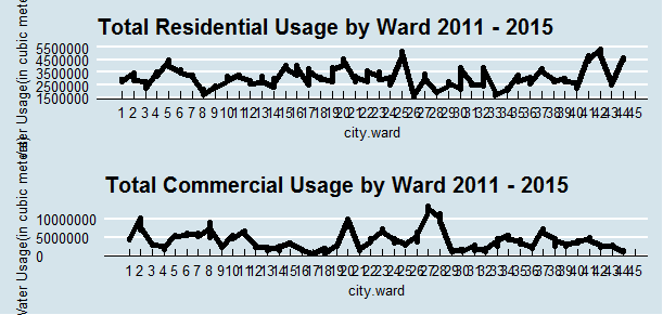
It is clear that ward 42, - Scarborough-Rouge River had the most residential usage and Ward 27, - Toronto Centre Rosedale had the most commercial usage in total from 2011 to 2015.
p3 <- ggplot(data=water,
       aes(x=city.ward, y=average.residential.usage)) +
       geom_line(size = 2) +
  scale_x_continuous(breaks = seq(1, 45, 1)) +
  ylab('Water Usage(in cubic meters)') +
  ggtitle('Average Residential Usage by Ward 2011 - 2015') +
  theme_economist()
p4 <- ggplot(data=water,
       aes(x=city.ward, y=average.commercial.usage)) +
       geom_line(size = 2) +
  scale_x_continuous(breaks = seq(1, 45, 1)) +
  ylab('Water Usage(in cubic meters)') +
  ggtitle('Average Commercial Usage by Ward 2011 - 2015') +
  theme_economist()
grid.arrange(p3, p4, ncol=1)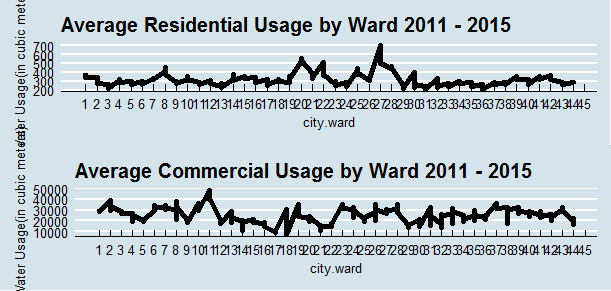
Again, ward 27, - Toronto Centre Rosedale had the most residential usage on average from 2011 to 2015, and ward 11, - York South West consumed the most water commercially on average from 2011 to 2015.
water1 <- water
water1$average.residential.usage <- NULL
water1$average.commercial.usage <- NULL
water_long <- melt(water1, id = c('city.ward', 'year'))
ggplot(data=water_long,
       aes(x=city.ward, y=value, color = variable)) +
       geom_line() +
  ylab('Total Water Usage(in cubic meters)') +
  ggtitle('Total Water Usage') + facet_wrap(~year) + theme_economist()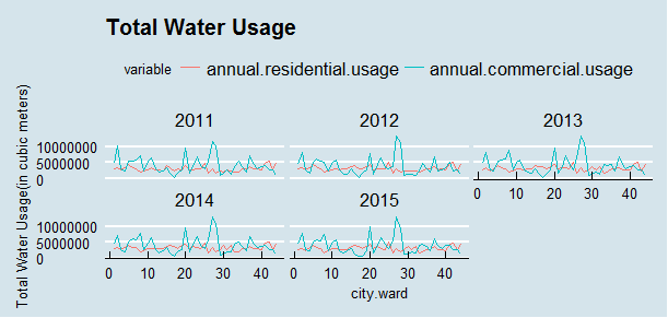
It has been consistent that ward 27 consumed the most water commercially every year from 2011 to 2015.
ggplot(data=water,
       aes(x=city.ward, y=average.commercial.usage)) +
       geom_line() +
  ylab('Water Usage(in cubic meters)') +
  ggtitle('Average Commercial Usage') + facet_wrap(~year) + theme_economist()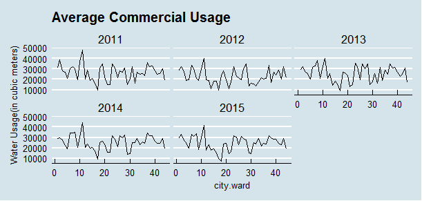
ggplot(data=water,
       aes(x=city.ward, y=average.residential.usage)) +
       geom_line() +
  ylab('Water Usage(in cubic meters)') +
  ggtitle('Average Residential Usage') + facet_wrap(~year) + theme_economist()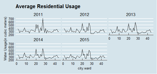
The average residential usage has been decreasing over the years, we now use less water then we did five years ago.
##summary(water2011$average.residential.usage)
##   Min. 1st Qu.  Median    Mean 3rd Qu.    Max.
##    240     288     313     335     353     706
##summary(water2015$average.residential.usage)
##   Min. 1st Qu.  Median    Mean 3rd Qu.    Max.
##    212     263     274     299     323     534
Now what? It’s map time! I downloaded the ESRI Shapefile from city of Toronto Open Data portal. This data set includes the boundaries for the City of Toronto’s 44 municipal wards.
library(rgdal)
library(sp)
ogrInfo("C:/Users/Susan/Documents/gcc/Projects/Open Data/Files/Data Upload - May 2010/May2010_WGS84", "icitw_wgs84")
##Source: "C:/Users/Susan/Documents/gcc/Projects/Open Data/Files/Data Upload - ##May 2010/May2010_WGS84", layer: "icitw_wgs84"
##Driver: ESRI Shapefile; number of rows: 44
##Feature type: wkbPolygon with 2 dimensions
##Extent: (-79.64 43.58) - (-79.12 43.86)
##CRS: +proj=longlat +datum=WGS84 +no_defs
##LDID: 87
##Number of fields: 10
## name type length typeName
##1 GEO_ID 0 9 Integer
##2 CREATE_ID 0 9 Integer
##3 NAME 4 40 String
##4 SCODE_NAME 4 10 String
##5 LCODE_NAME 4 20 String
##6 TYPE_DESC 4 25 String
##7 TYPE_CODE 4 4 String
##8 OBJECTID 0 9 Integer
##9 SHAPE_AREA 2 19 Real
##10 SHAPE_LEN 2 19 RealIt took me sometime to figure it out how to read it.
toronto.rg <- readOGR("C:/Users/Susan/Documents/gcc/Projects/Open Data/Files/Data Upload - May 2010/May2010_WGS84", "icitw_wgs84")##OGR data source with driver: ESRI Shapefile
##Source: "C:/Users/Susan/Documents/gcc/Projects/Open Data/Files/Data Upload - ##May 2010/May2010_WGS84", layer: "icitw_wgs84"
##with 44 features
##It has 10 fields
Here we have a simple map of Toronto to show all three layers.
Use fortify function to turn the map into a data frame so that it can easily be plotted with ggplot2, which produce this data frame:
library(rgeos)
toronto.rg.df <- fortify(toronto.rg, region = "SCODE_NAME")
toronto.rg.df$id <- as.integer(toronto.rg.df$id)
ggplot(data=toronto.rg.df, aes(x=long, y=lat, group=group)) +
  geom_polygon(fill = 'grey80', color = 'black', size = 1) + theme()
head(toronto.rg.df)
## long lat order hole piece id group
##1 -79.63 43.74 1 FALSE 1 1 01.1
##2 -79.63 43.74 2 FALSE 1 1 01.1
##3 -79.63 43.74 3 FALSE 1 1 01.1
##4 -79.64 43.74 4 FALSE 1 1 01.1
##5 -79.64 43.75 5 FALSE 1 1 01.1
##6 -79.64 43.75 6 FALSE 1 1 01.1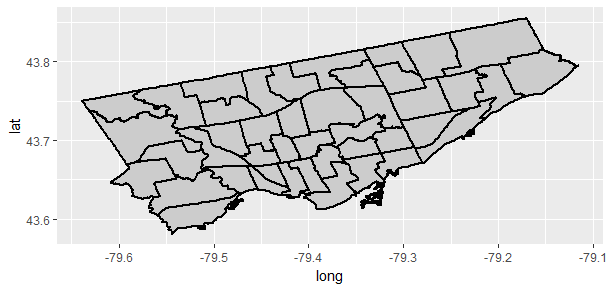
Merge our water dataframe with the map data. This time, I will be looking at 2015 usage only.
water_2015_df <- merge(toronto.rg.df, water2015, by.x = 'id', by.y = 'city.ward')
water_2015_df <- water_2015_df[order(water_2015_df$order), ]
centroids  <- as.data.frame(gCentroid(toronto.rg, byid = T))
centroids[['id']] <- toronto.rg@data$SCODE_NAME
total_commercial_2015 <- water_2015_df[c(1:8,11)]
ggplot(data = total_commercial_2015, aes(x = long, y = lat, group = group)) +
geom_polygon(aes(fill = annual.commercial.usage), color = 'red', alpha = 0.8) +
scale_fill_gradient(name='Water Usage in Cubic Meters',low = '#56B1F7', high = "#132B43") +
labs(title = "Toronto Total Commercial Water Usage by Ward 2015") +
geom_text(aes(x=x,y=y, group=NULL, label=id), data = centroids, size=2)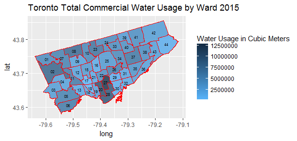
total_residential_2015 <- water_2015_df[c(1:9)]
ggplot(data = total_residential_2015, aes(x = long, y = lat, group = group)) +
  geom_polygon(aes(fill = annual.residential.usage), color = 'red', alpha = 0.8) +
  scale_fill_gradient(name='Water Usage in Cubic Meters',low = '#56B1F7', high = "#132B43") +
  labs(title = "Toronto Total Residential Water Usage by Ward 2015") +
  geom_text(aes(x=x,y=y, group=NULL, label=id), data = centroids, size=2)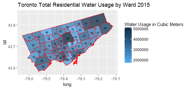
average_commercial_2015 <- water_2015_df[c(1:8, 12)]
ggplot(data = average_commercial_2015, aes(x = long, y = lat, group = group)) +
  geom_polygon(aes(fill = average.commercial.usage), color = 'red', alpha = 0.8) +
  scale_fill_gradient(name='Water Usage in Cubic Meters', low = '#56B1F7', high = "#132B43") +
  labs(title = "Toronto Average Commercial Water Usage by Ward 2015") +
  geom_text(aes(x=x,y=y, group=NULL, label=id), data = centroids, size=2)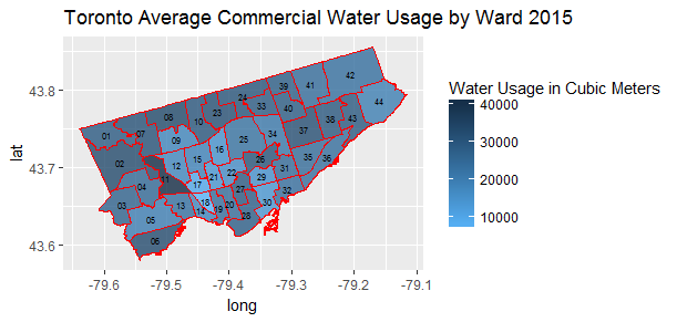
average_residential_2015 <- water_2015_df[c(1:8, 10)]
ggplot(data = average_residential_2015, aes(x = long, y = lat, group = group)) +
  geom_polygon(aes(fill = average.residential.usage), color = 'red', alpha = 0.8) +
  scale_fill_gradient(name='Water Usage in Cubic Meters', low = '#56B1F7', high = "#132B43") +
  labs(title = "Toronto Average Residential Water Usage by Ward 2015") +
  geom_text(aes(x=x,y=y, group=NULL, label=id), data = centroids, size=2)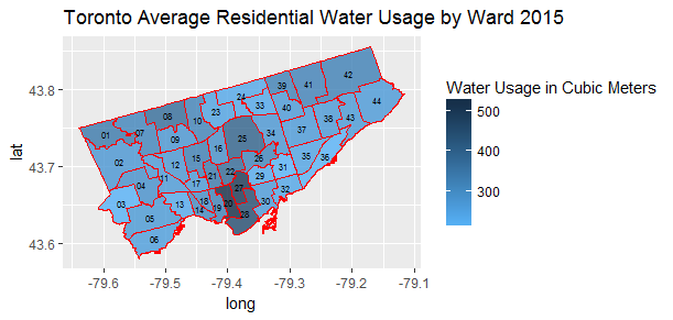
The end
Commercial water users are the top consumers of the most water in Toronto, and they are spread out throughout the city in many wards. And heavy residential water users are only concentrated in a few wards of the city.
Water use is a major policy, environmental and social issue. Understanding water usage is important everywhere. The cost of water went up in January of 2014 by nine per cent. We are lucky that Toronto is built on a lake that contains about 1640 cubic kilometers of water. But New study calls average water use by Canadians ‘alarming’.
I have really enjoyed working on this project. I hope the city of Toronto will release the data by month, and type of user such as residence, park, business, school, hotel, restaurant etc, so that I will be able to perform a more in depth analysis.
Source code that created this post can be found here. I am happy to hear any feedback or questions.